Enter
WINNERS 2019
Best of
A-1 Corporate & Brand Identity
Share:


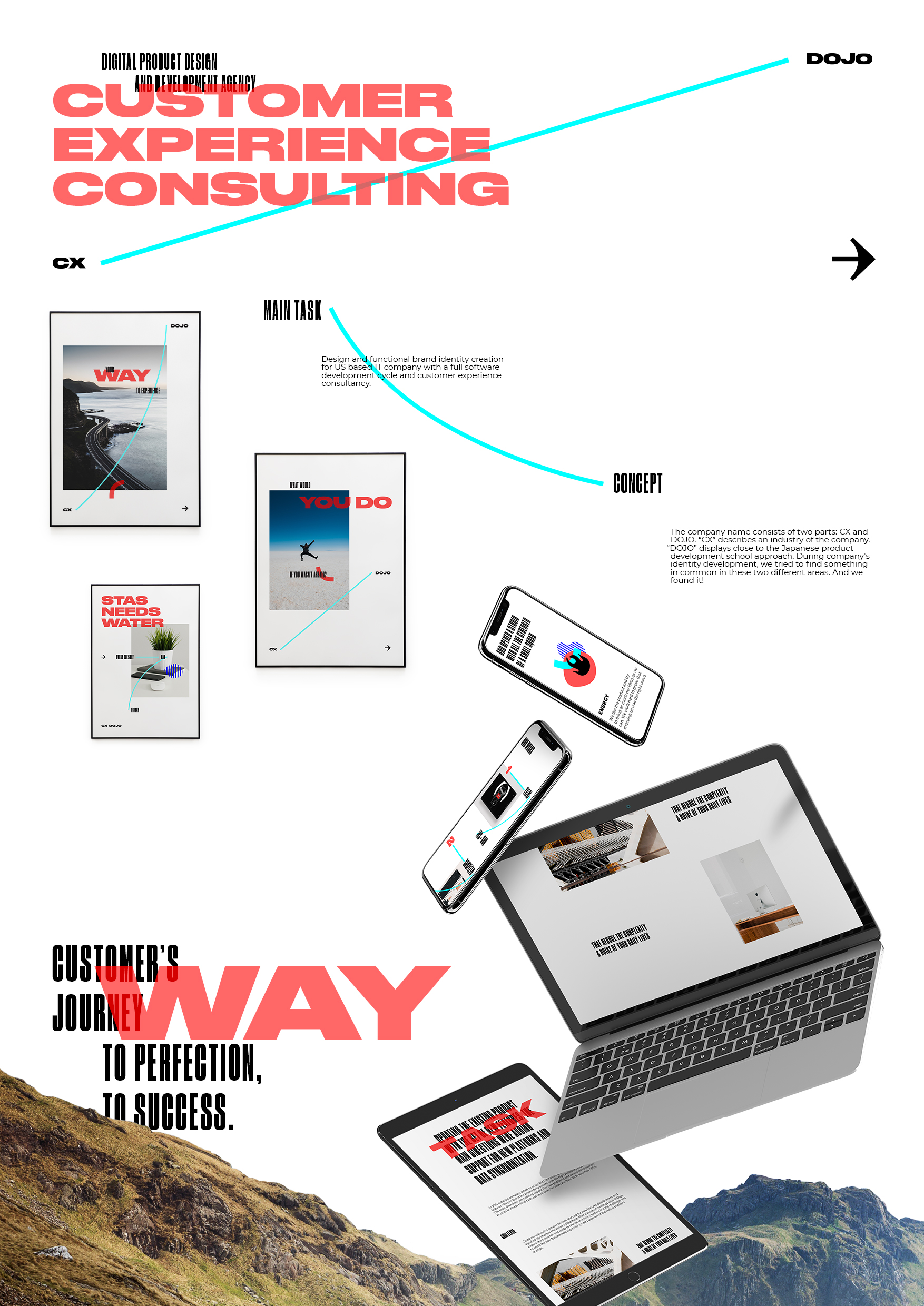
CX DOJO
A-1-33 League Design Agency
The company name consists of two parts: CX and DOJO. "CX" describes an industry of the company. “DOJO” displays close to the Japanese product development school approach. During company's identity development, we tried to find something in common in these two different areas. And we found it! Customer Journey Map is often used to improve customer experience. It is a powerful technique for understanding what motivates your customers, what their needs are, their doubts and problems. Customer Experience is a way customer makes with a company. DOJO School is an institution that provides classrooms and a learning environment for students. But DOJO is not only a place. This is how people sharpen their skills, this is also the master's way. The essence of the CX DOJO brand is a Way. Customer’s journey to perfection, to success. An image of a path formed a basement for a dynamic company’s logo. The line connecting two parts of the name, same as a digital products user seeks the shortest way. The overall aesthetics of the identity and design for the site is based on the works of Japanese calligraphers: a large white space, a contrast of sizes and a dynamic composition. Brand identity is based on the opposition of a super-narrow black and super-wide red fonts. The choice of a color wasn’t random. Brand colors are inspired by views of Tokyo at night and its neon lights. To illustrate benefits of the company on the website were created unique icons. The illustrations of the icons are contrast to the company graphics, but they remain within the overall style due to the narrow patterns like the in the headings, made in red and blue colors. These illustrations act as a stimulus in the corporate style and help company's website to stand out and be remembered. More fun!