Вхід
Переможці 2019
Best of
A-1 Corporate & Brand Identity
Поділитися:


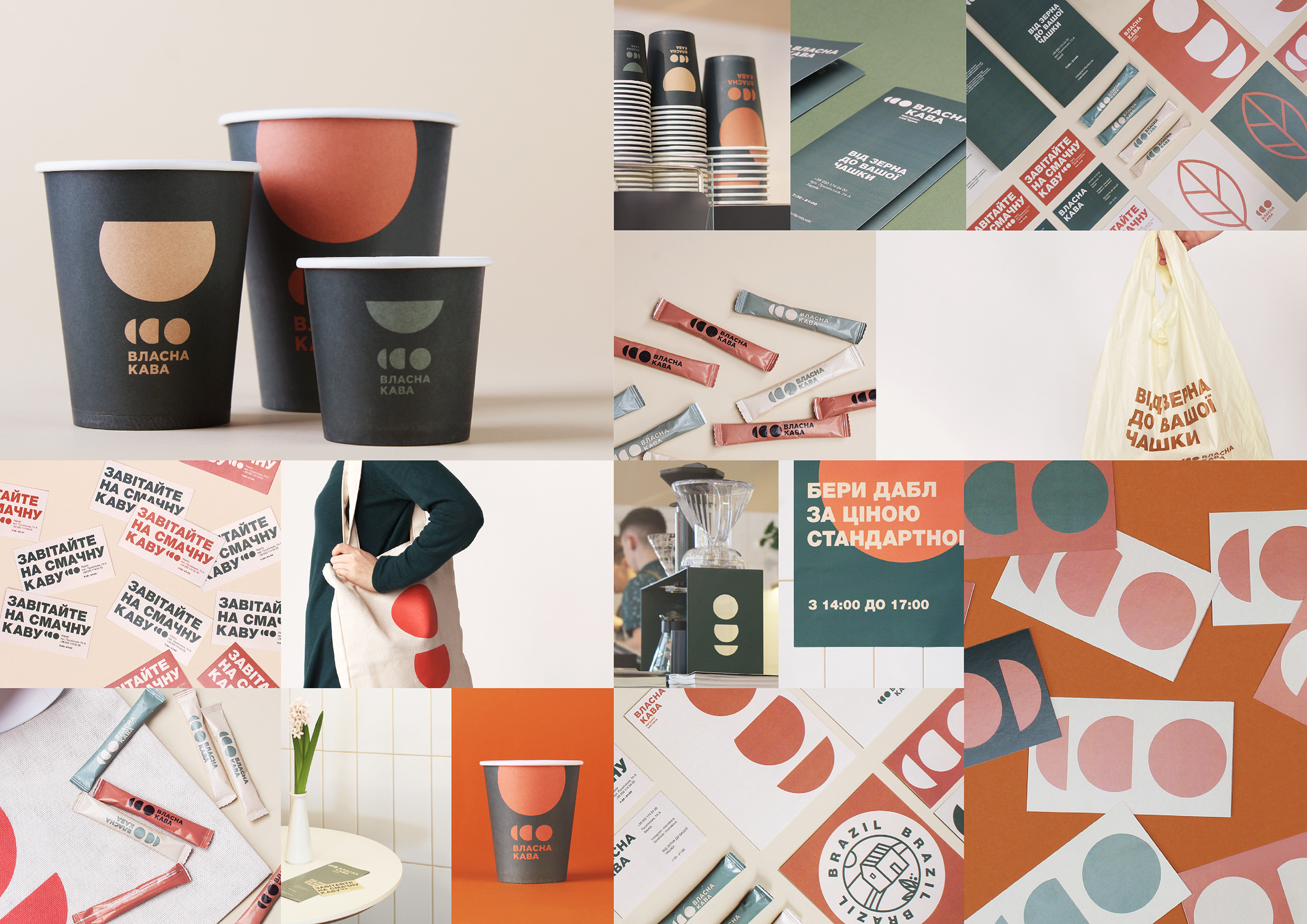
Vlasna Kava
A-1-9 Canape Agency
Vlasna Kava is a coffee shop in Kharkov. It`s an atmospheric place that will become your guide to the world of coffee from grain to cup. We have created a very symbolic design system in order to convey to consumers the concept of the coffee shop and its main principles. Each element of this design system — logo, font, color — says about a coffee bean and the coffee industry. The purpose of the corporate style is to indicate the features of the store (manufacturability, orderliness) and, at the same time, to reveal the coffee shop idea. This brand identity is created to be informative. The main graphic instruments are texts and forms. We use illustrations only to identify countries of the beans origin on the stickers. The identity contains a lot of useful information that the visitor can read on the booklets, posters on the facade of the building, business cards and promotional printing. The logo consists of the symbolic and font parts. The symbolic part shows the development from a fragment of a shape to a whole figure — circle. For the text part of the logo, we chose a simple font that harmoniously and unobtrusively integrates into the urban space and attracts the desired target audience. Corporate colors are beige, terracotta, light and dark green: the color of all your favorite cappuccino, colors of coffee beans from fresh to roast. The colors interact with each other and create a soft pastel image that is easy to remember.