WINNERS 2019
Best of
B-1 Websites design
Raketka.ua
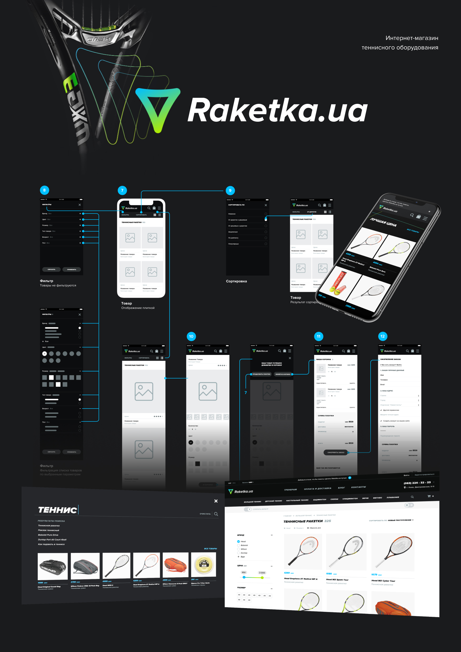
01. Task. The main task was to increase sales by online store Raketka.ua. For the first, the user experience was improved. And then, using a new identity, which was created for the brand earlier, online store was redesigned. 02. UX. To improve the user's experience, a search was made to finds the goods without page reloading. The flow of adding goods to the basket was also improved. On the desktop version was made an overlay basket for a quick purchase. And also was rebuild the feedback system of goods. 03. Identity. Design of the user interface was based on the corporate style of the brand Raketka.ua. All UI elements were designed using fonts, colors, gradients and decorations of the corporate identity Raketka.ua. All this was done to consolidate the brand recognition online. 04. Mobile first. In today's world, online shopping without smartphones is very difficult to imagine. More than 50% of users buy on the Internet with the help of their smartphones. Therefore, one of the main tasks was design smooth mobile user experience. 05. Perfect button. One of the main tasks in this project was to create a perfect button for the target action. Was necessary to achieve that the consumer wanted to press it. The button pulsation was made to draw attention in the passive state. After hovering on this button it stretches showing the name of the target action, for pushing the user to act. 06. Interface. Most of the basic elements of the interface are designed to evoke a user's desire to interact with them, while not taking away the user from the targeted action - the purchase. 07. Promotion. The main slider task on the main screen is to inform visitors about promotions, news, etc. The slider works in connection with banners, to create a single promotion system. Banners change its position in the columns of sections of goods for don’t stop attracting attention.


