WINNERS 2020
Best of
A-11 Packaging Design
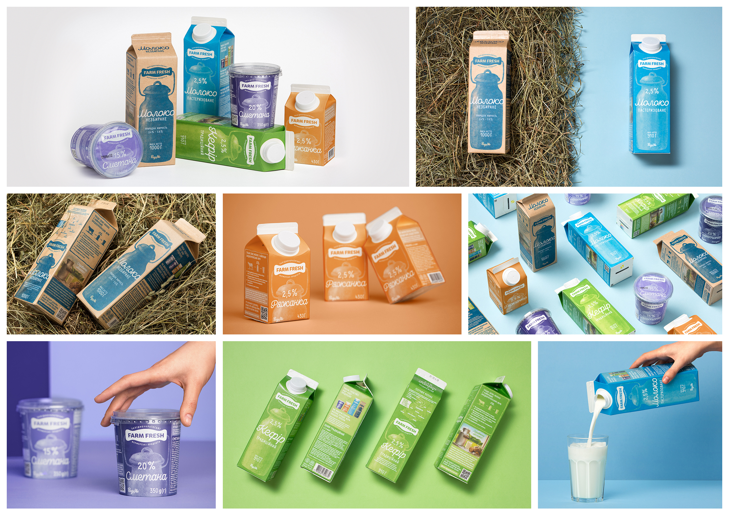
Packaging design for the dairy product line «Farm Fresh»
«Farm Fresh» is a dairy product from local Western Ukrainian farms made in the traditional way from whole milk, under modern quality control. Our task was to create packaging for a new product of its kind, focusing on its naturalness and freshness and profitably allocate it on the shelves among other products. We needed to convey a sense of authenticity, as well as tell about the origin, features, and benefits of the product. The buyers of the product are people who appreciate the naturalness and authenticity, suit the choice of food and strive to consume the freshest products. In the process of finding the idea, we worked on symbols that would convey the tradition, authenticity of the product, while avoiding the characters that are common in the packaging design of the product range. This is how we started to use the can that is used traditionally to store dairy products as a symbol. We set out the goal of creating a nostalgic association, reminding consumers of the childhood feeling when real steamed milk was a commonplace. The can shadowgraph has become the main visual symbol of the packaging. The logo was already designed based on the packaging, so it fits into the design organically and is part of a single integrated image. The product series of the brand includes 6 main products, therefore we have selected harmonious colours for easy product differentiation. A special feature of «Farm Fresh» products is the craft line, which uses only whole milk with natural fat. To distinguish this product from others and to emphasize its naturalness, a kraft paper packaging was created for it. Packaging played a great role in the process of positioning a new product brand in the market. «Farm Fresh» dairy products are recognizable, stand out well on store shelves among other dairy products. The packaging looks aesthetically pleasing, in particular, to the photos that promote CGC.


