WINNERS 2020
Best of
A-11 Packaging Design
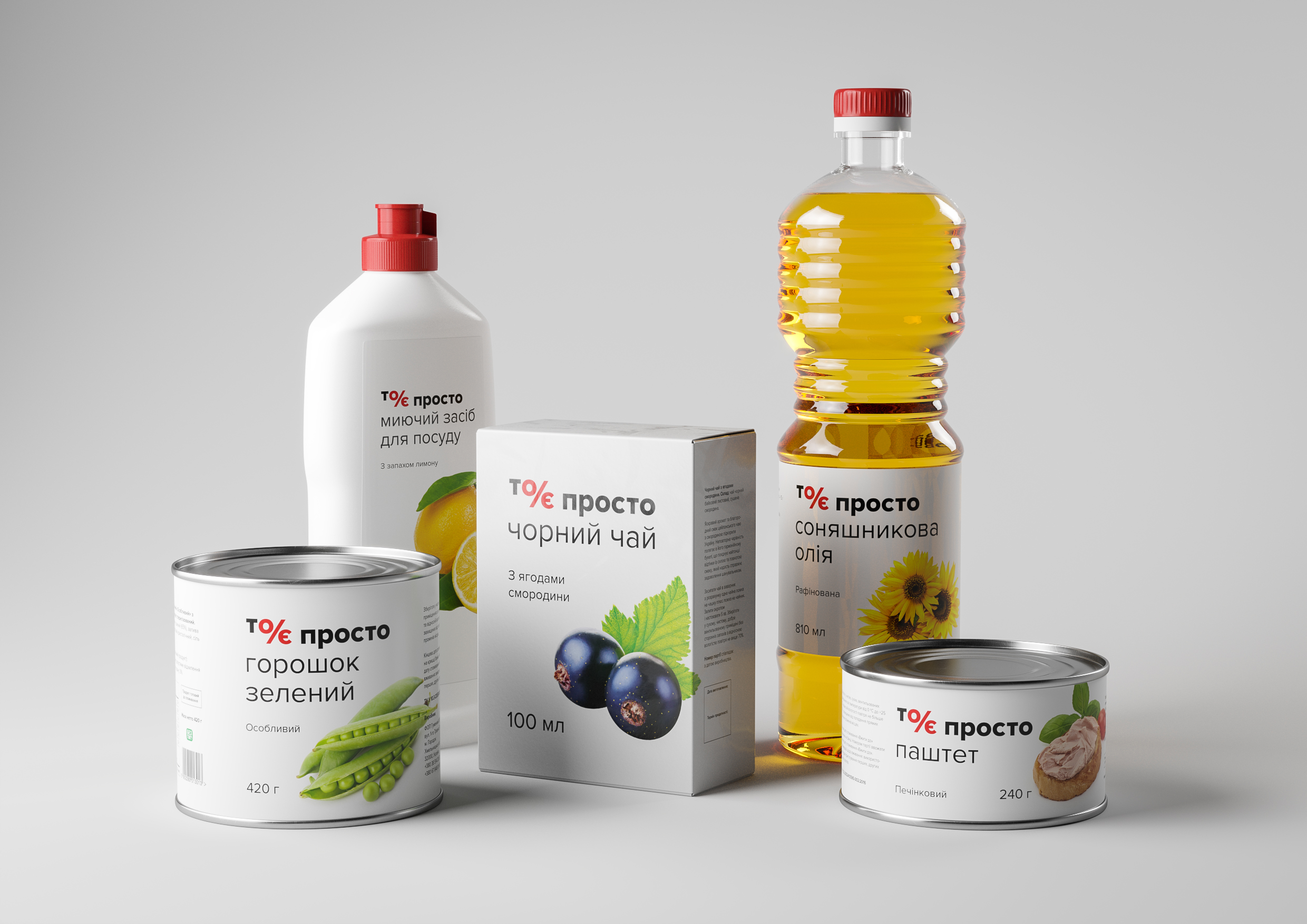
Packaging for “To ye prosto”
“To ye prosto” (This is just a...) is the own-brand of Ukrainian retailer “Rukavychka”. Its range includes basic reasonable price goods for everyday use. Target market of «To ye prosto» are retirees, students and people with low income. We were required to create a packaging design concept understood by the target market, showing all features of the brand and easily adapting to different products and packaging types. We realised that the target market is paying attention to discounts, promotions, markers with typical colors and symbols. Our concept is based on the graphic element "%" formed with the letters "O" and "Є". With the shape of the logo and the colors, we hint at the affordability of the brand. Overall design has a direct association with cost savings, which reinforces brand positioning.


