Enter

WINNERS 2020
Best of
A-20 Concept Design (Unrealised project)
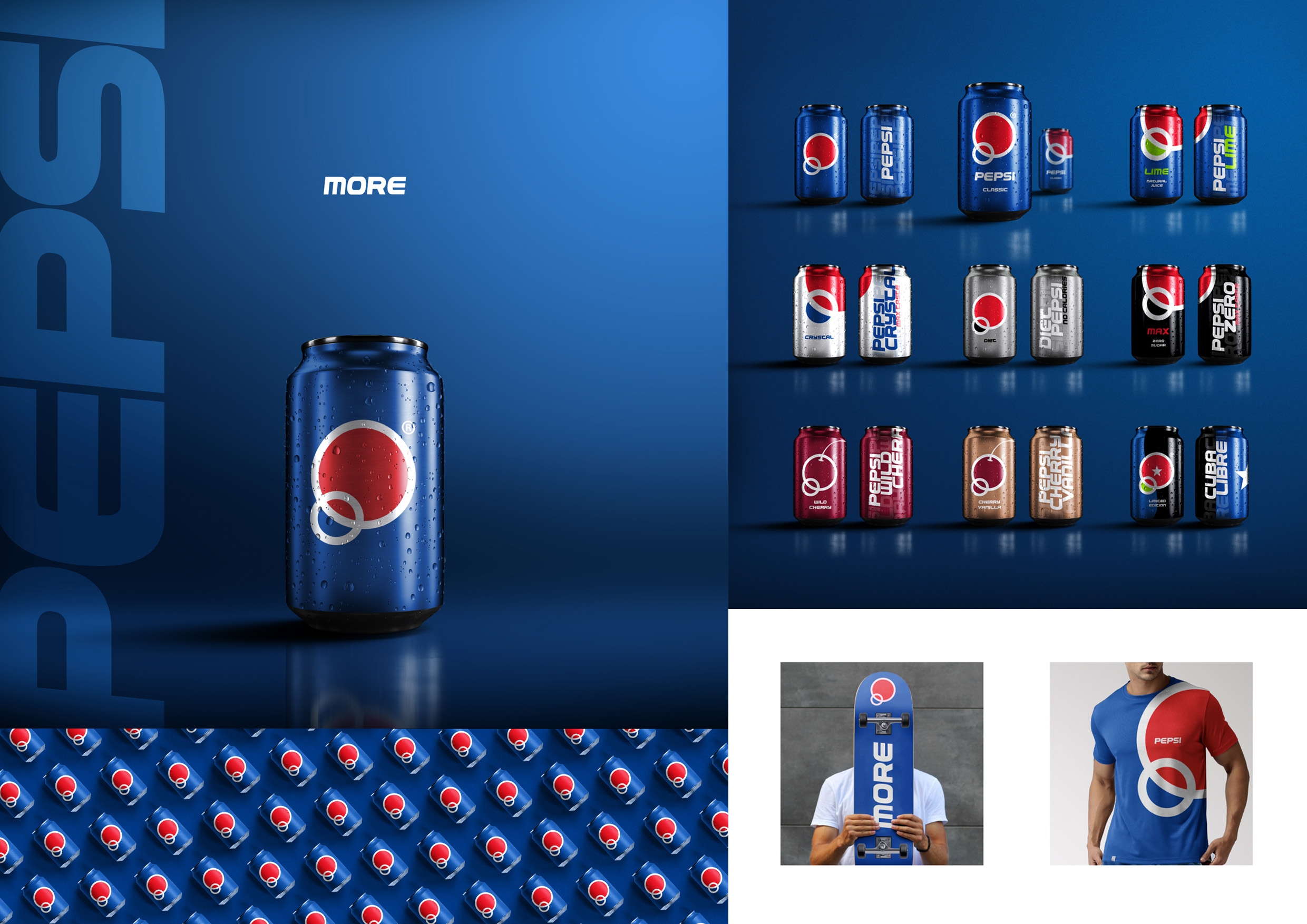
Pepsi Logo and Brand Identity Re-Design
A-20-5 Антон Супруненко
The task was to redesign Pepsi logo and identity which will both keep the brand attributes and represent the new look that can help to refresh the brand design on the market. The concept of minimalism "less is more" was used for identity and logo design. The word that purely reflects the spirit of Pepsi brand in a broad sense is "More". With removing all unnecessary and keeping one single word, the brand got more with less.


