WINNERS 2020
The Very Best of
A-21 Student Design
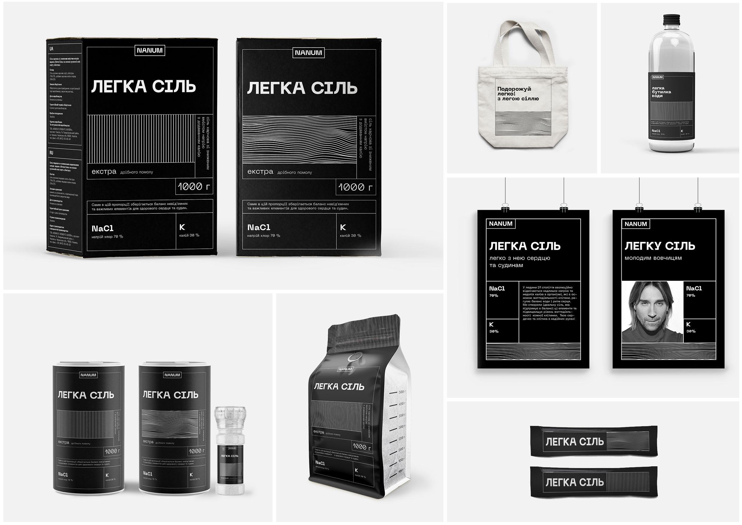
Packaging concept for «Legka Sil» salt
Legka» sіl is a registered trademark of LLC Chemical Elements Ukraine. This is not a common salt, its chip in the composition is in the balance of microelements, that reduces mortality from cardiovascular diseases by 70%. And it’s this salt’s super power. Task: to create a series of packages and an identity for «Legka Sil» to show its super power using accessible visual language to enter the market. Concept: Black color as a dissonance in the context of the usual packaging of salt. I wanted the consumer interested in and even outraged by the black packaging among the white salt. I’ve also used a modular grid, that helped to place the content on the product in easy and quick to read way. Even the usual thing like ingredients, expiration date and production date.


