WINNERS 2021
Best of
B-1 Digital Platforms & Websites design
Beany
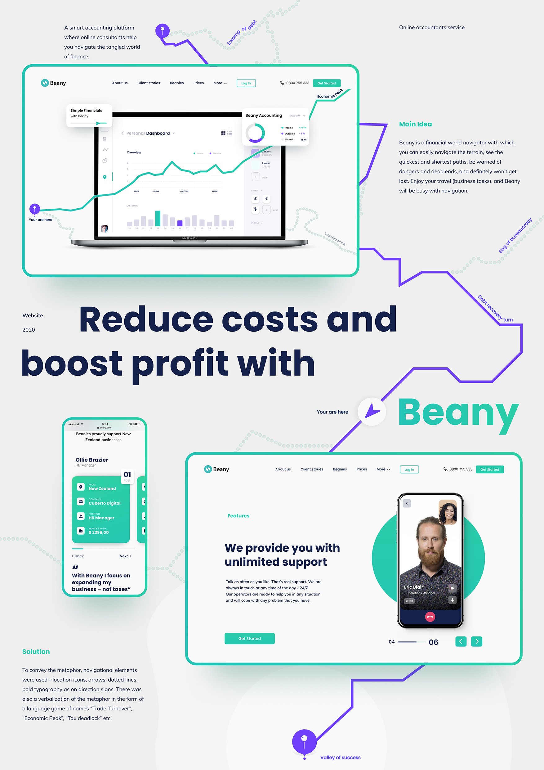
Beany is a smart accounting platform where online accountants help small businesses navigate the tangled world of finance. Beany is all focused on making things easier for small business owners by increasing the opportunities and minimizing tax requirements. Now it was time to make things easier for Beany with the help of design. Our main task was to increase the conversion rate. For that, we needed to overcome users’ fears of a complex tax system first. After days of brainstorming and whiteboarding, a design solution was born. We decided to present Beany as a navigator in the financial world. It can easily navigate business terrains, see the quickest and shortest paths, warn small businesses of dangers and dead ends, and never let them get lost. To convey a navigator’s metaphor, we used in design such elements as — location icons, arrows, dotted lines, bold typography, which are usually present in the direction signs. We even tried to verbalize the metaphor by using the play on words “Trade Turnover,” “Economic Peak,” or “Tax deadlock,” etc. Now entrepreneurs can sleep well. Beany takes care of financial navigation, and the League increases website conversion.


