Enter
WINNERS 2019
Best of
A-1 Corporate & Brand Identity
Share:


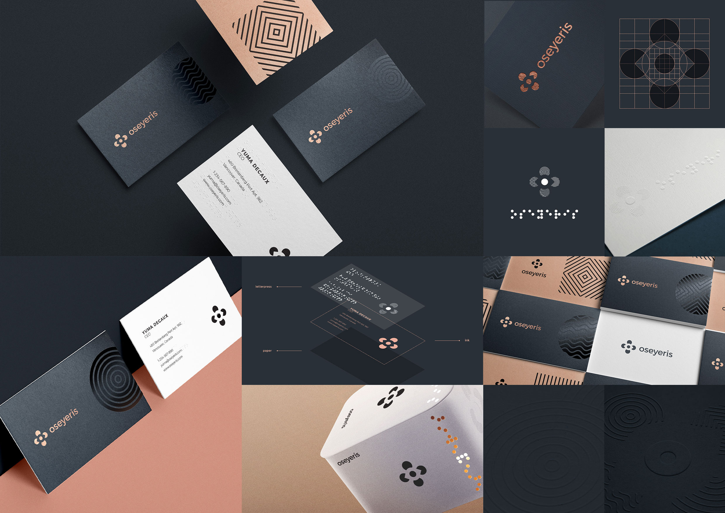
Oseyeris
A-1-16 Товт Тібор
OSeyeris blends hardware and software to provide everyday utility devices which bridges the gap between the sighted and the visually impaired. It is an IoT startup founded to help people with severe sight damage. The challenge was to design a highly-accessible identity that reflects the company’s core mission: recreate vision. Brain plasticity refers to the brain’s ability to adapt to a changing environment. In other words, it is the brain’s ability to compensate the loss of one sense by using other senses better. Blind people recreate vision by collecting input from other senses. We used this concept for the logotype. The final identity was inspired by the braille tactile writing system and illusory contours — they evoke the perception of an edge without a luminance or color change across that edge. The core idea was: to see something that’s not actually there — for sighted — and to perceive something you can’t see for the blind. The developed logotype is a simple depiction of the concept of sensory substitution. The outer shapes stand for the four senses, while the eye symbol is formed by the negative space. We also developed a set of geometric patterns for embossing, letterpress or spot gloss. These textures are meant to provide a tactile experience and make interaction with Oseyeris products richer from the very first touch.