Enter
WINNERS 2019
Best of
A-1 Corporate & Brand Identity
Share:


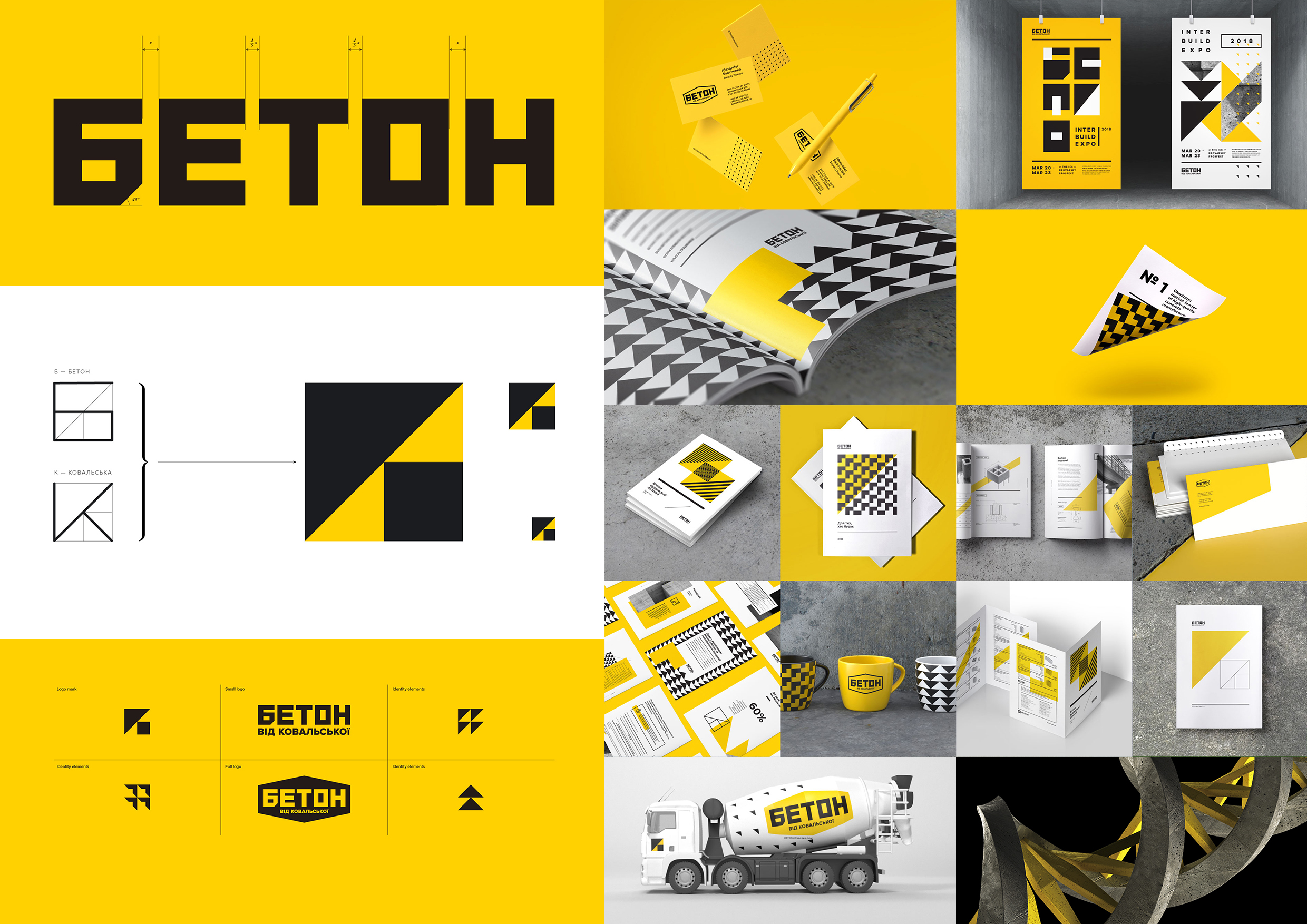
Concrete by Kovalska
A-1-93 Tough Slate Design Agency
«Concrete from Kovalska» is a vivid example of the construction epic at the domestic market. For 15 years the brand complies with all features applicable to a leader in the field of the manufacture of quality concrete products: more than 1500 formulas, 600 concrete mixing transport trucks with volumes ranging from 4 to 12 cu m, 28 concrete mixing facilities, 15 polygons and test grounds with up-to-date equipment for producing reinforced concrete products. At the moment, concrete is not just the trend — it is needed as never before, and the need only grows. The reputation of the brand is confirmed by statistics: millions of shipped cubic meters of concrete, as well as the fact that every second object uses Concrete by Kovalska. With the development and changes within the company "Concrete from Kovalska" there was a pressing issue of updating the brand's visual identity. The target was to refresh the overall look as well as find a bold way to clearly communicate the brand’s greatest values: constructiveness, relevance, modernity, and passion for the business. Our team had to develop a new approach, sticking to only three constants: color, shape, and concrete. Stylish constructive basic sign: concrete is the first and basic material for construction. The symbol is rich in primitives, from which we will create interesting patterns — this faceless concrete will acquire interesting images, derived from its sign.