Enter
WINNERS 2019
Best of
A-1 Corporate & Brand Identity
Share:


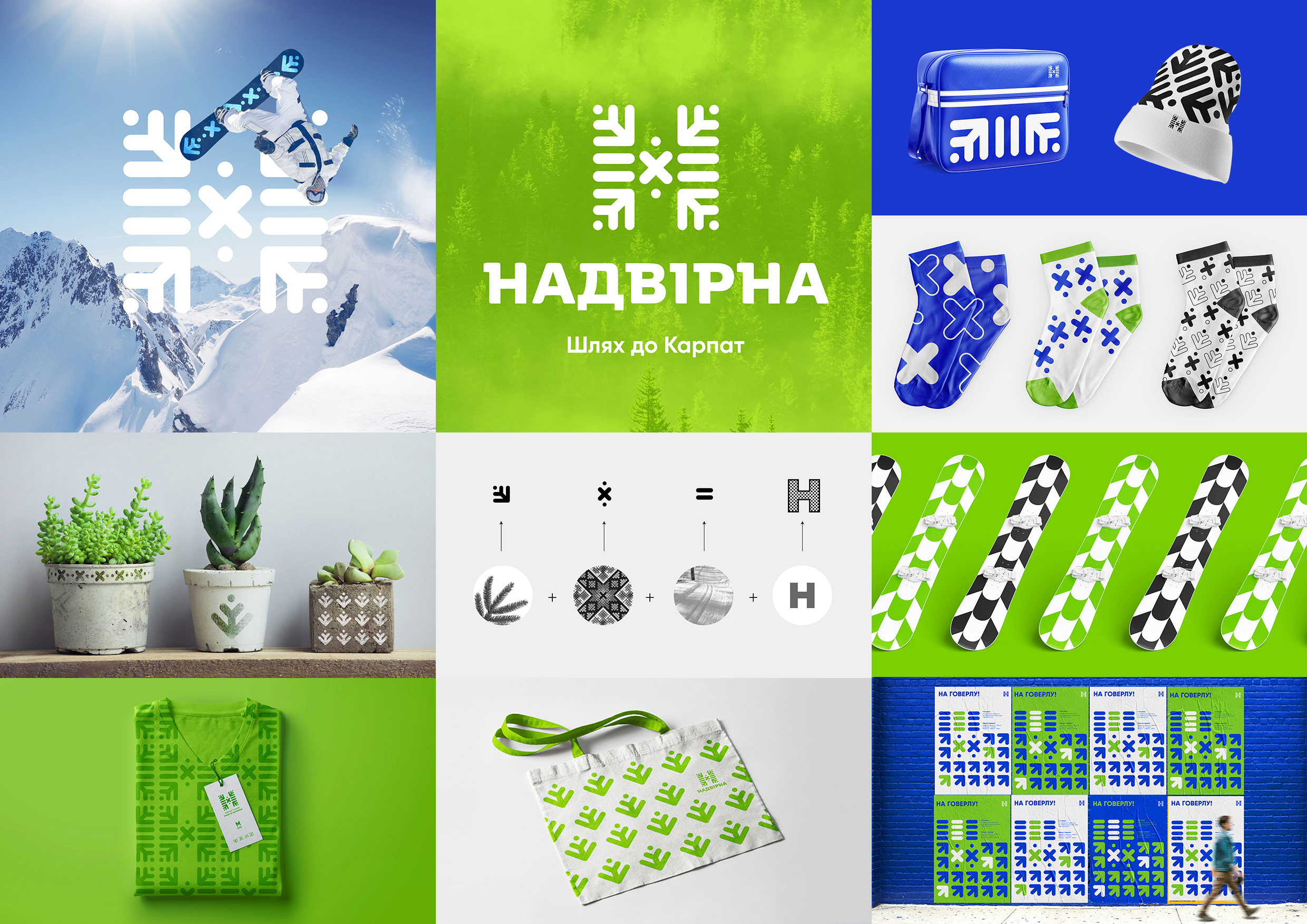
Nadvirna City Logo & Identity
A-1-96 Tough Slate Design Agency
The task was to create a logo for the city Nadvirna, the first point of the ukranian Carpathians. Nadvirna combine in itself the both: dawning fogs and ski equipment rental; rocky stream rivers and the launch of mountain biking; the culture of Hutsul art & crafts and the fabrics of production the wooden souvenirs, the transparent pure fresh air and bottling & production of the mineral water. These two directions are connected in the one place - in the city Nadvirna. This city is an intersection, a meeting place of many way, routes and senses. The concept of the route is represented also in the slogan — the path to the Carpathians. So Nadvirna is the crossroads of two senses — aesthetic and practical, — this thought was the base for the concept of the logo. So the «x» in the center of composition of the logo sign represents the crossing. And the other graphic elements depicts all this crossed directions.