Enter
WINNERS 2020
The Very Best of
A-1 Corporate & Brand Identity
Share:


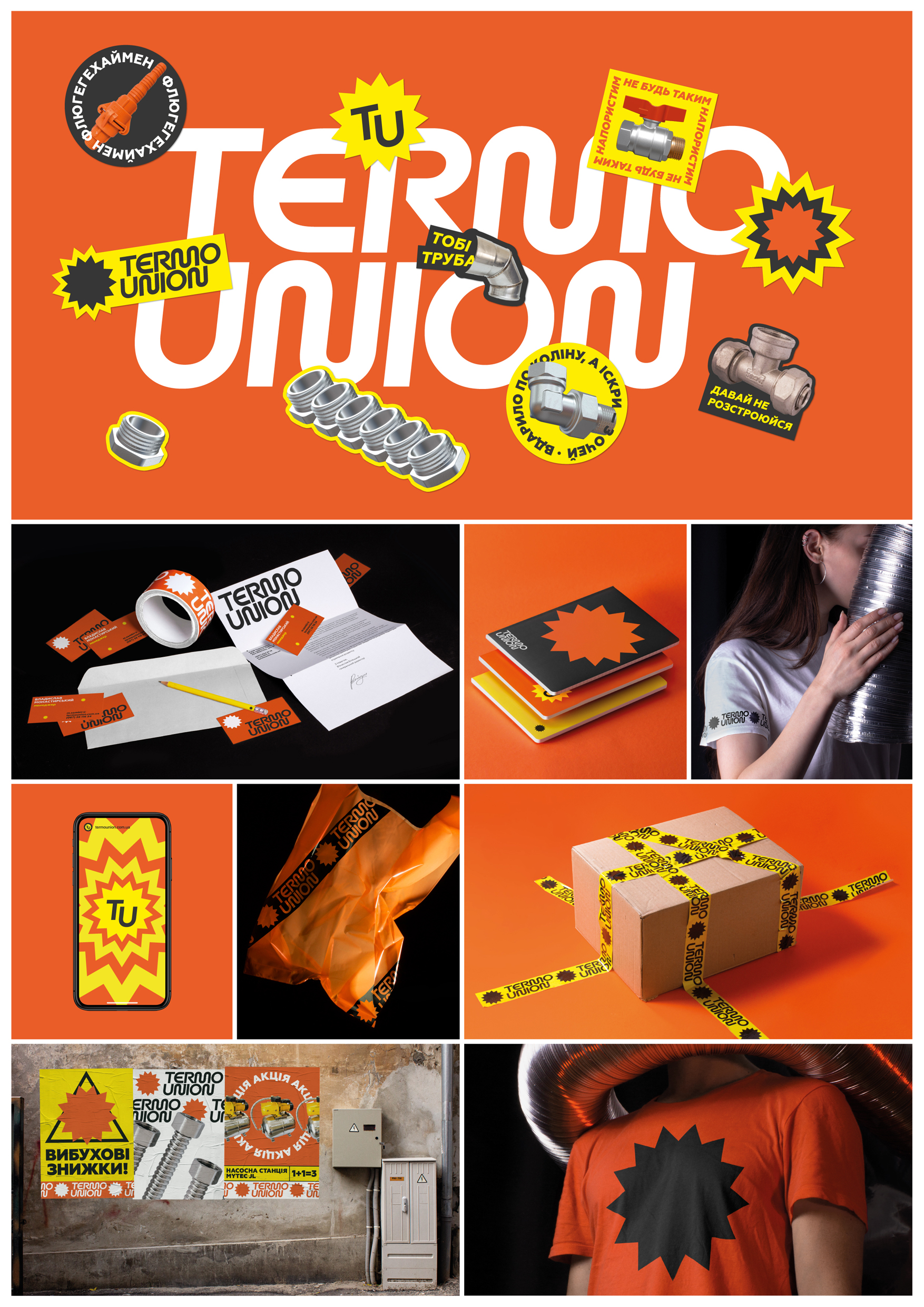
Termo Union
A-1-33 Gram Branding
Termo Union is a chain store selling heating and water supply systems. The store range has over 4000 items of certified products with warranty and service support in Ukraine. In addition to retail sales, the store offers individual consultations and goods delivery in Western Ukraine. The company adheres to the principle: “Quality solution at a reasonable price”. Goal: Develop a clear visual identity for a retail chain. Challenge: Assure consumers in high quality of goods and the reliability of the supplier. Bring to consumers confidence in a retail store selling products of unknown brands. Increase brand recognition and differentiate it from competitors. Solution: Working on a new brand identity, we decided to experiment with graphic forms. Bold expressive graphics demonstrates a confident brand position, reliability along with readiness for change in the modern world. Clear lines emphasize the professional approach and competence of the company's specialists. We developed a special font for the logo, featuring letters M and N like bends of the pipes, which are the main product of the store. The main identity color is orange. Auxiliary colors are black, white and yellow. All together they help to remember the brand, recognize it among others, and enhance the reputation of the company. We developed images that can be used as stickers and graphic elements on posters to indicate discounts. They have free space for writing the number of discounts.