Enter
WINNERS 2021
Best of
A-1 Corporate & Brand Identity
Share:


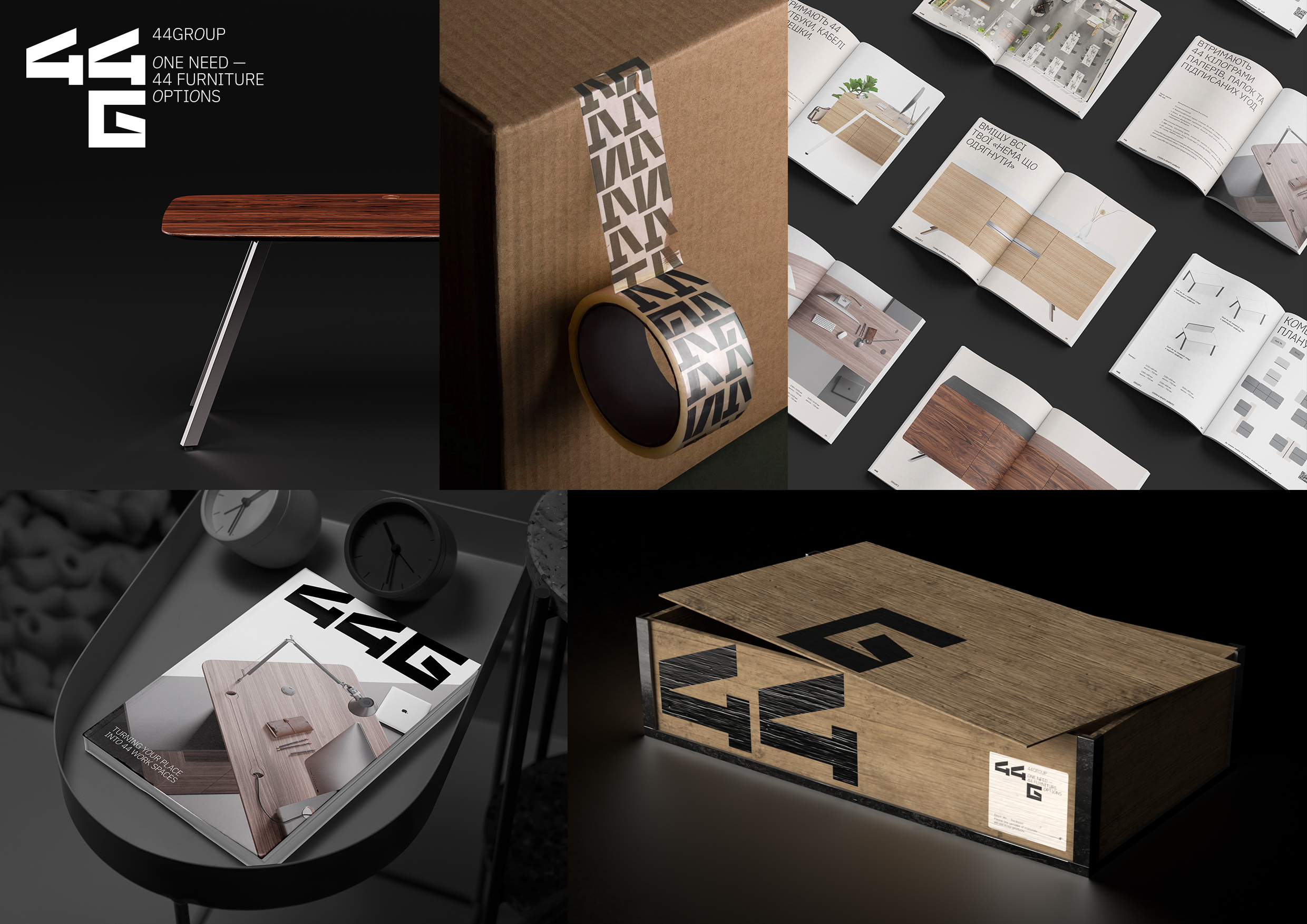
44 Group: Brand Identity
A-1-73 Qubstudio
44GROUP manufactures furniture and interior items for public facilities with the possibility of reuse or disposal. And also sells ready-made furniture solutions, expert consulting, warranty, packaging and delivery. Challenge: There is one big and powerful player on the market who is a role model. Due to this, most brands look monotonous and get lost in the overall picture. The goal was to create an expressive visual language that would communicate a unique look with the help of neat graphic solutions. Solution: Sharp and beveled geometric elements of numbers and letters reflect the active development of the 44GROUP brand. Dynamic graphics are combined with light and delicate typography. In the descriptor, this visual energy is enhanced by the italic letter "O", which is also a key feature in the catalog headers. It creates a visual connection with the logotype. There are also two sub-brands: 44SCHOOL and 44HOME. The 44GROUP brand works with space, and therefore the logo is placed in space. According to this principle, there are 21 options for combining the number 44 with the letters G, S and H. As there are some limitations when you work with a restricted space, the logotype also should reflect this. One of them is the location of the number 44. It always takes place in front of the letters. The brand is consistent in its actions, communication, and visual identity. 44GROUP believes in a world in which there is no "too much". Too much furniture, too little space or too high cost of services. 44GROUP clearly understands the industry, provides expert advice on space and cost planning and does what it declares.