Enter
WINNERS 2021
The Very Best of
A-20 Concept Design (Unrealised project)
Share:


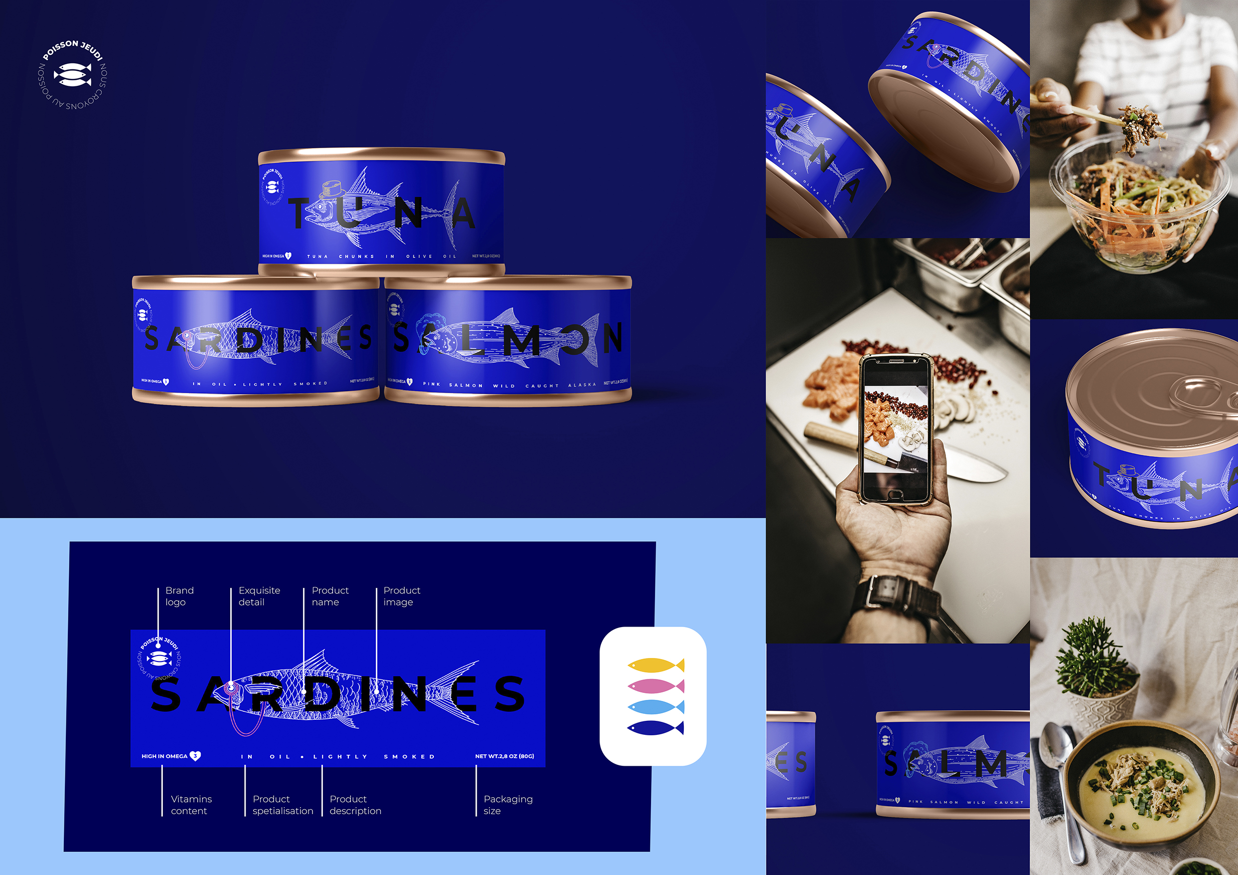
Canned fish design concept
A-20-15 GURT
The task: logo and package design development for the French canned fish brand "Poisson jeudi". A simple symbol of three fish is chosen for the logo, as the customer will see the same carefully placed pieces of fish when opening the package. The text is placed in a circle, symbolizing the cycle - from the sea to the table. This is supported by a slogan with selection of a thinner font. Each fish (salmon, tuna and sardines) is unique so an illustrative image is selected for packaging. High quality of the product emphasized by small aristocratic elements - a monocle, a cylinder and a tube. There is a story behind each fish. The word "sardine" originated from the Italian island of Sardinia. And there is a theory, that a delicate accessoire - a monocle was invented nearby. In ancient times tuna was depicted on Greek and Celtic coins, so, as another symbol of wealth, a cylinder depicted. The salmon may spend three, or even four years in the ocean before returning to their home rivers to spawn. After such an adventure the salmon has gainednot only valuable experience but also the refined habit of smoking a pipe.