Переможці 2015
Best of
A-2 Logo
Zhytomyr City logo
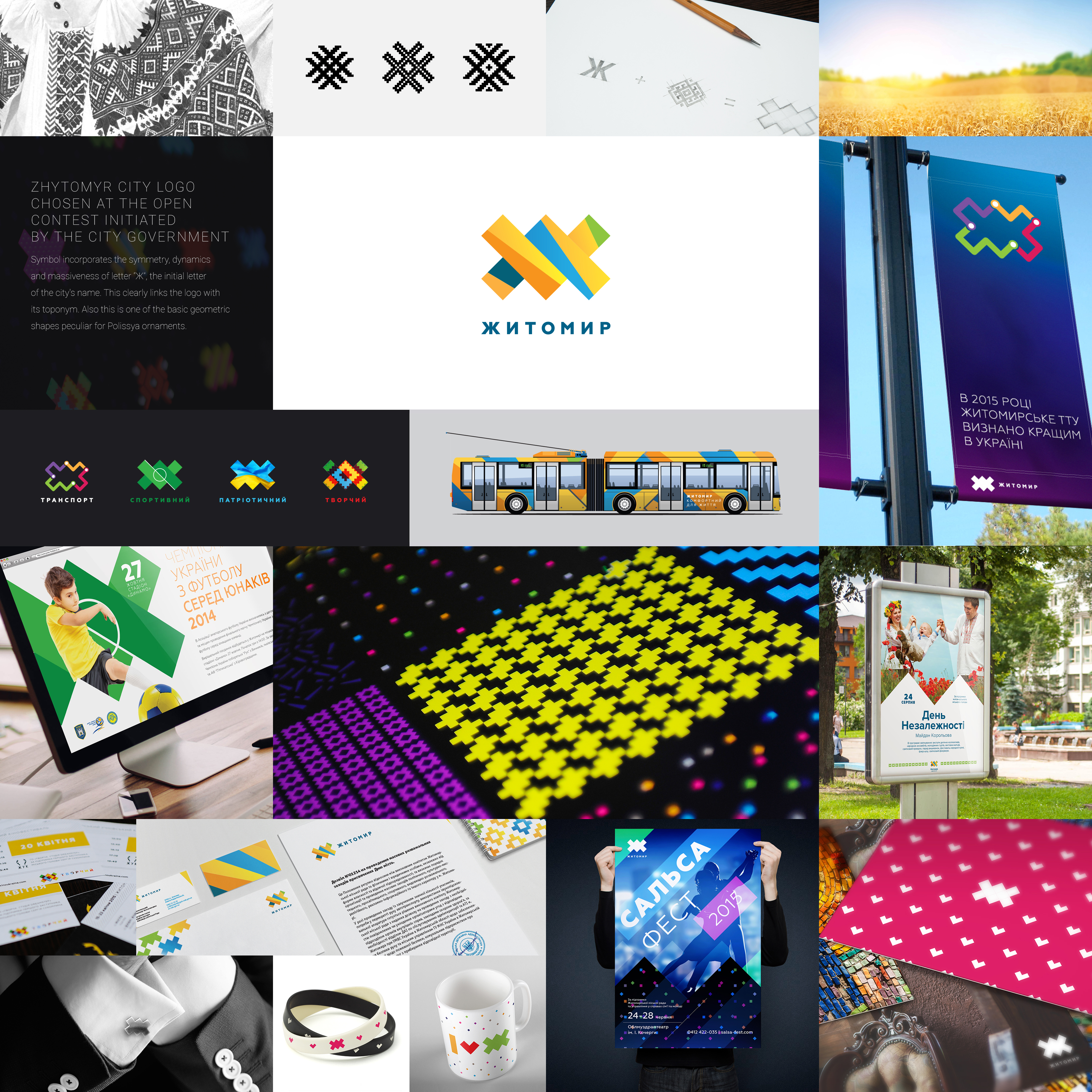
The process of logo creation was aimed at merging its significance from the perspective of historical memory and its correspondence to modern aesthetic standards. We’ve used a symbol. This is one of the basic geometric shapes peculiar for Polissya ornaments. Here we can see ancient elements ofrhombuses, crosses and strips inherent in embroidery, weaving, carving, Easter eggs painting and pottery of Zhytomyr area. The art critic Yurii Lashchuk said that: "The artistic and pictorial language of this symbol distinctly reflects the artistic principles and standards as well as worldview and outlook of Zhytomyr Polissya inhabitants". The symbol incorporates the symmetry, dynamics and massiveness of Cyrillic letter “Ж”, the initial letter of the city's name. This clearly links the logo with its toponym. The basis for the color scheme was taken from the landscape familiar to the inhabitants of Polissya: golden rye, blue sky and green forest. The logo is easy-to-remember, easy-to-read and versatile. Its shape easily fits both national and ultramodern patterns. It is scalable and maintains recognizability on any medium. Also it can be rendered on the most of materials.


