Вхід

Переможці 2018
Best of
A-4 Packaging design
Mo? Package and Identity
A-4-16 spiilka
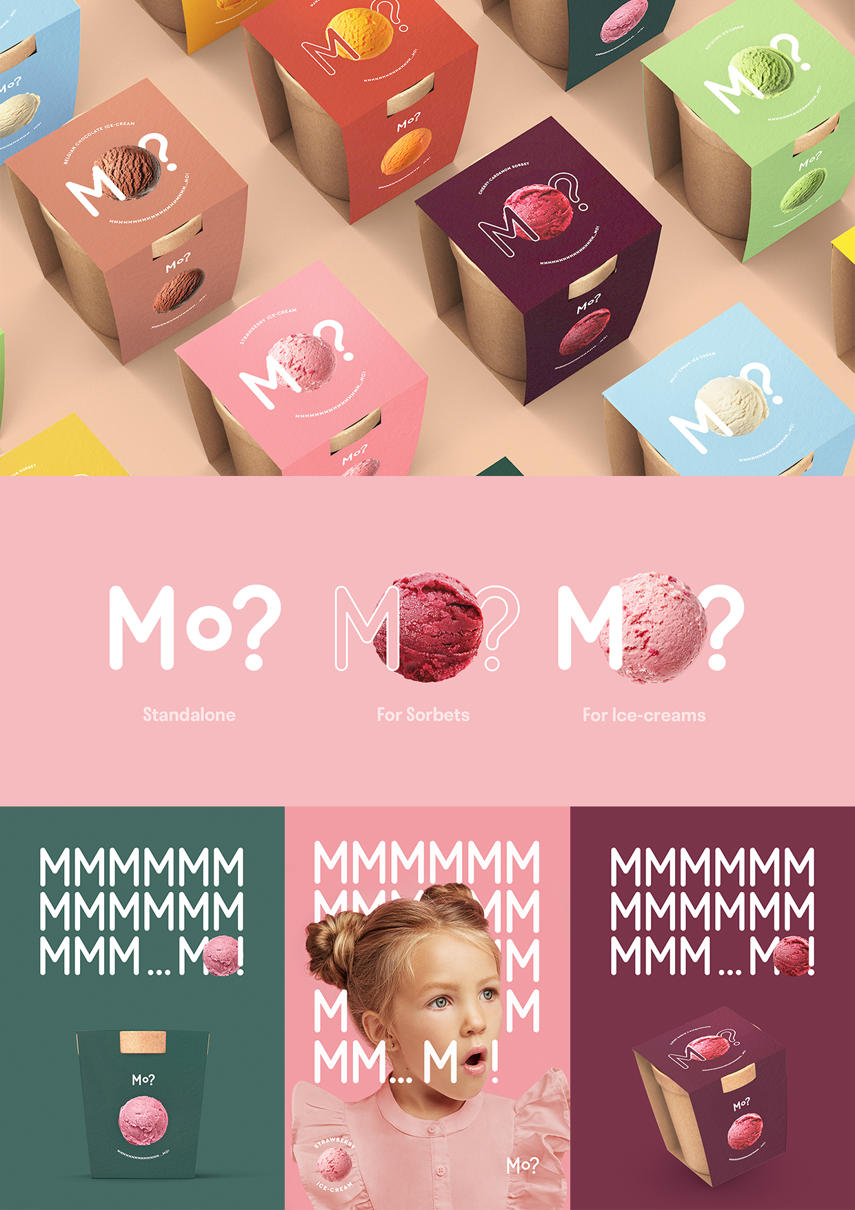
Who would resist working on an ice-cream package, right? We had a great pleasure to create visual identity for a craft tastiness by Silpo. M&O are the first two letters of the word morozyvo (ice-cream — Ukrainian). We decided to build the communication on these two letters to stay in the line with the brand’s minimalistic approach. The name Mo? turned into an invitation to taste an ice-cream, and the eloquent answer Mmmmm…Mo! — became its motto. For the packaging design we aimed to build a visual on the platform of minimalism: laconism in colors and fonts, without unnecessary details and leave only the essence. In addition, to develop communication and packaging that distinguish from competitors and turn our limitations into advantages.


