Переможці 2019
Best of
A-4 Packaging design
Yellow Head cheese packaging
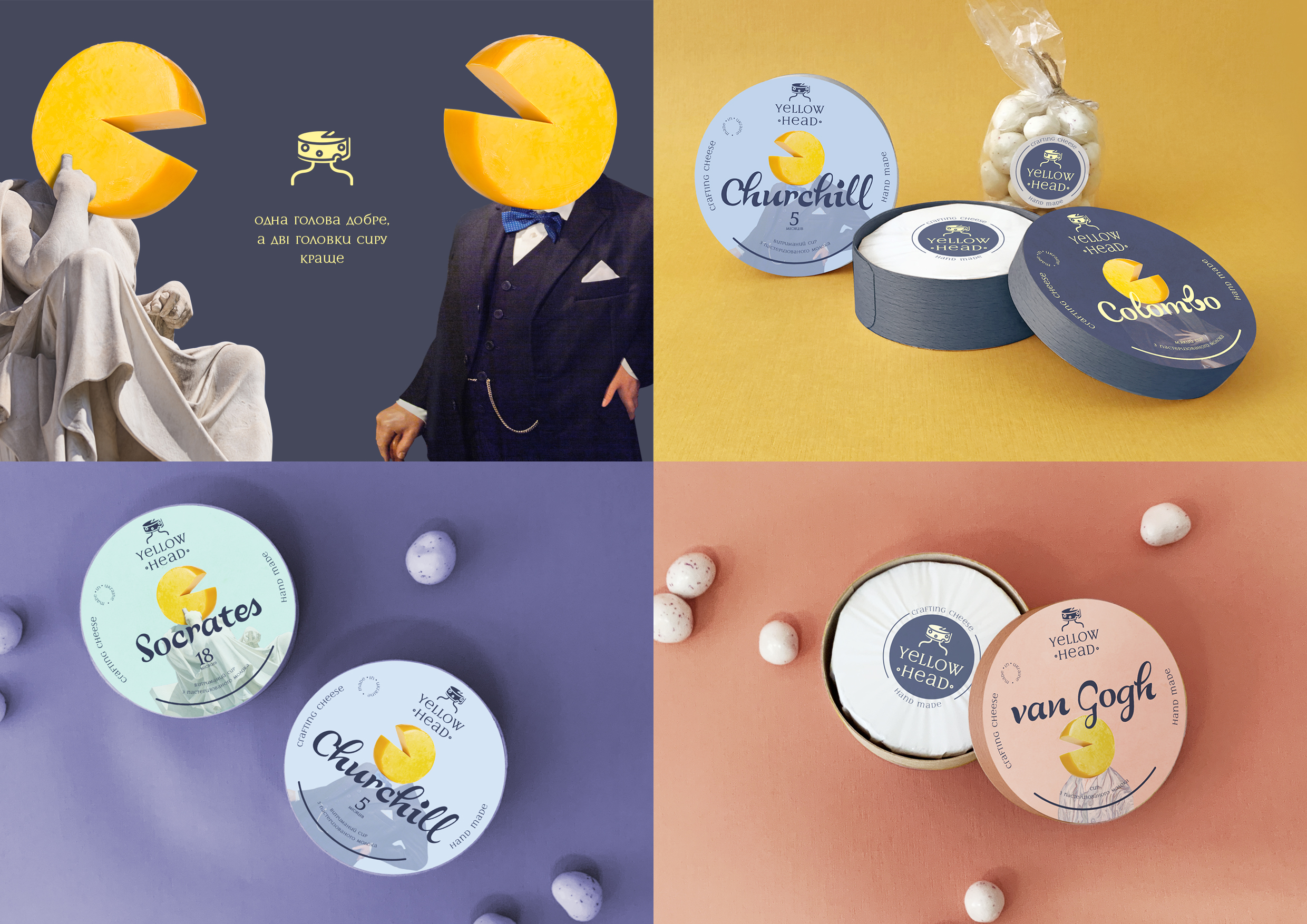
About the goal: The agency’s goal was not just to develop a brand for a product, whose quality is beyond doubt and whose manufacturers are the partners to be proud of. Our goal turned out to be more meaningful and ambitious: we needed to attract attention to a product, which is, by any standard, as good as produce coming from the established foreign brands, but is manufactured here, in Ukraine – according to the formula, following all the technological processes and complying with all the standards. We had to create a brand name and visual communication for craft Ukrainian cheeses, a product made by professionals for connoisseurs and gourmets. In search of a name for a taste Going through hundreds of possible cheese names, we kept two main lines of the product in mind: the obvious benefit for everyone’s health – the brain, in the first place, and pleasure, a subtle yet well understood pleasure of tasting a ripe cheese. And where there’s pleasure, there’s always inspiration, insight, and bright thoughts! Not without reason it’s said that two heads are better than one, and especially better if they’re made of cheese: more wholesome, productive, and simply tastier. This chain of simple associations led us to a simple, obvious at first glance and therefore memorable name – “Yellow Head” TM. But we didn’t stop there: the idea of bright minds has found its way into the trademark’s product line. “Socrates”, “Churchill”, “Bruegel”, «Van Gogh», «Colombo» – these heads of cheese perfectly reveal the character and flavors of cheeses behind the names. And the motto is just another reminder that “Two heads of cheese are better than one”. That’s how a good idea looks like The visual solution for the brand was a reflection of verbal communication and visual representation of the trademark’s advantages: an illustration as solution emphasizes the craft nature of the product and develops a handmade image for the brand. As a result: we developed a concept of a new Ukrainian brand of high-quality cheeses that is simple, clear, laconic and evokes familiar associations both verbally and non-verbally: from words to images. The logo itself looks like a stylized head of cheese in a circle. The colors are laconic and sober, stylish in a not-boring way. Fonts were especially taken care of – we chose a handwritten variant that refers to the craft and handmade nature of products, looks sharp and readable. Every kind of cheese within the product line has its own package with a visual hint at where the person it’s named after came from: for “Churchill” those are the famous landmarks of England, for “Socrates” – those of Greece.


