Переможці 2019
Best of
B-3 Mobile apps design
InList
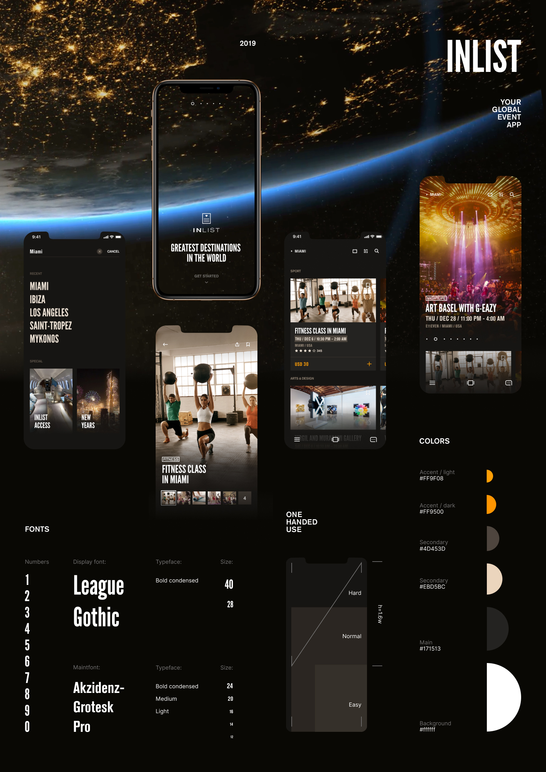
The customer asked for the application redesign, and the application already has regular users. Therefore, it was necessary to maintain the application’s recognition. For this purpose, the current application’s design system was taken as a basis revised and supplemented. 1. InList is the top mobile application for booking exclusive and curated parties, sporting events, concerts and once-in-a-lifetime experiences. We are in jet-set cities spanning Miami, New York, Las Vegas, Paris, London, St. Tropez, Ibiza, Dubai, Bali and more. 2. The fonts were taken from the current application. A new flexible font system was created. Condensed typefaces were used to fit a large information amount into the mobile interface. 3. The current application’s color scheme was analyzed. The accent color served to create a new more active shade. The new accent color, in addition to enhancing brand identity, is responsible for the active interface elements function. 4. The new accent color served as the basis for creating a palette of light and dark shades. Initially, the accent color was used to work with a dark background. But later on, a more saturated accent color shade was created for working with a light background. 5. 95% of the content is about the night parties and events. Often people use the app at night. Therefore, the main colors were made in dark shades with a focus on contrasting content. 6. The target audience’s preferences have been analyzed. Therefore, it was decided to use real photos from parties and events for deeper emotional involvement. 7. The user can skip the login and signup to quickly review the events in the application. 8. The event feed is organized by city. A user can optionally configure the feed by date period, filter by event type, or find a specific event in the search. 9. The main new feature after the redesign is the possibility to add several events to the basket. This feature allows you to pay for several events at a time. This saves time and helps to organize a plan for several activities. 10. The screens are getting bigger and you need to take this into account when designing interaction with the application. Frequently-used interface elements have been designed for easy one-hand use of the application. 11. During the Concept Stage we’ve changed a product positioning dramatically. Events verity has increased greatly and the proportion of «Night Parties» decreased to 5%. In addition to «Night Parties» you can now sign up for «Wellness», «Yoga», «Running» and any kind of a unique experience.


