Переможці 2021
Best of
B-1 Digital Platforms & Websites design
Jump Organics
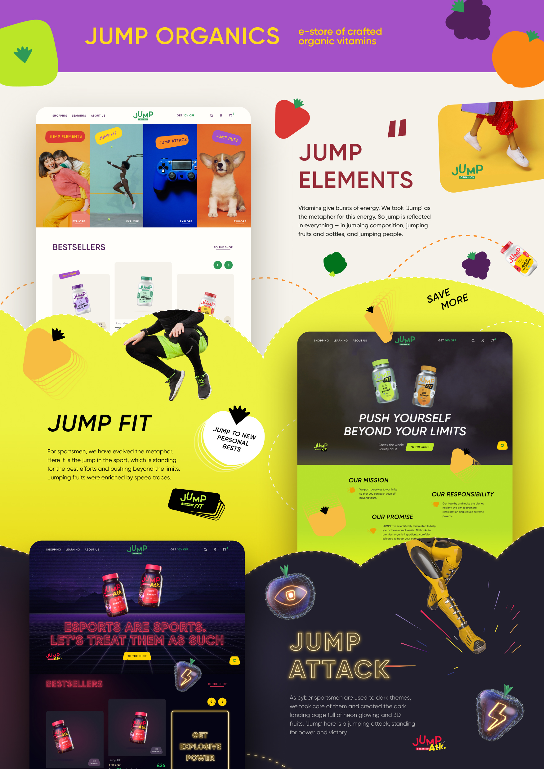
Jump Organics is an e-commerce website of organic vitamins, the vitamins for different kinds of people with different habits, lifestyles, and preferences — from athletes and professional gamers to people, who simply take care of their health and well-being. The goal was to redesign such a variegated website to stand out from competitors and still win the attention of the diverse target audiences. And we've got a solution. We created separate landing and product pages for each of them and stylized those pages according to their interests. At the same time, we found a way to keep the stylized pages' design in harmony with the rest of the site pages. Well-nailed! A brilliant metaphor helped us a lot. A jump — was a perfect concept to describe all products and could be a common speech figure for the entire brand. After all, jumping is about enjoying life, being healthy and happy. The jump metaphor influenced the composition's dynamics: some elements became intentionally higher to create a jumping effect; some vitamin jars jump up on the product card, and some links hop like on a trampoline. This effect was also supported by the decorations in the form of dotted trajectories. In visual stylizations, we tailored our metaphor even more subtly. For active people, this is a jump of joy and high spirits; for athletes, it symbolizes agility and strength; and for gamers — a jumping attack gives combat advantage and brings victory. What does it mean for us? All at once — agility and strength to handle a challenging project, a "hurray jump" after we've reached the client's business tasks, and, hopefully, a victorious jump after THE VERY BEST OF 2021.


