Вхід
Переможці 2017
The Very Best of
E-4 Urban design and public spaces
Поділитися:


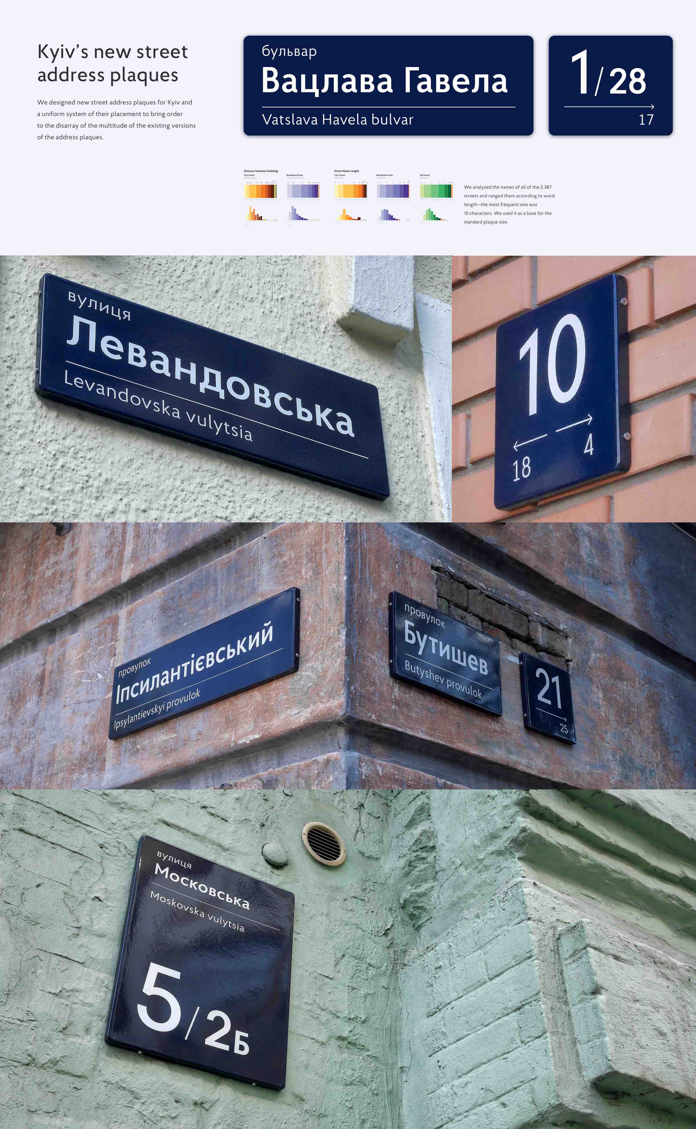
Kyiv’s new street address plaques
E-4-4 Агенти Змін
We designed new street address plaques for Kyiv and a uniform system of their placement to bring order to the disarray of the multitude of the existing versions of the address plaques. Design solution We determined the optimum size. We analyzed the names of all of the 2,387 streets and ranged them according to word length—the most frequent one was 10 characters. We used it as a base for the standard plaque size. Blue background In Kyiv, each building is painted its own color, so the main color of our plaque had to be in contrast with most types of building colors and make the plaque stand out among other signs. This is why we chose dark blue, which was also reminiscent of the color of Kyiv’s old plaques which can still be found on some buildings in the city. Separated plaques For better flexibility in the composition of plaques on façades and for a more convenient placement along the streets, we divided the street names and building numbers into two separate plaques. Now these are two independent elements, each of them with its own specific place on the façade, though they can still appear together on one plaque. Street names appear in places where people make their first contact with the street (for instance, at intersections, on street corners) while building numbers appear on each building. It lets us provide people with the information they really need in a particular spot and diminish the number of various signs on a building. Our main principles are the evidence based decision making and human centered design. Which is why we thoroughly research our every project and survey its users about their experience with our design. For instance, in order to find out if our plaques are convenient, we conducted shadowing sessions by observing people’s interaction with the plaques in real time and environment, we also ran online surveys.