Вхід
Переможці 2017
Best of
A-4 Packaging design
Поділитися:


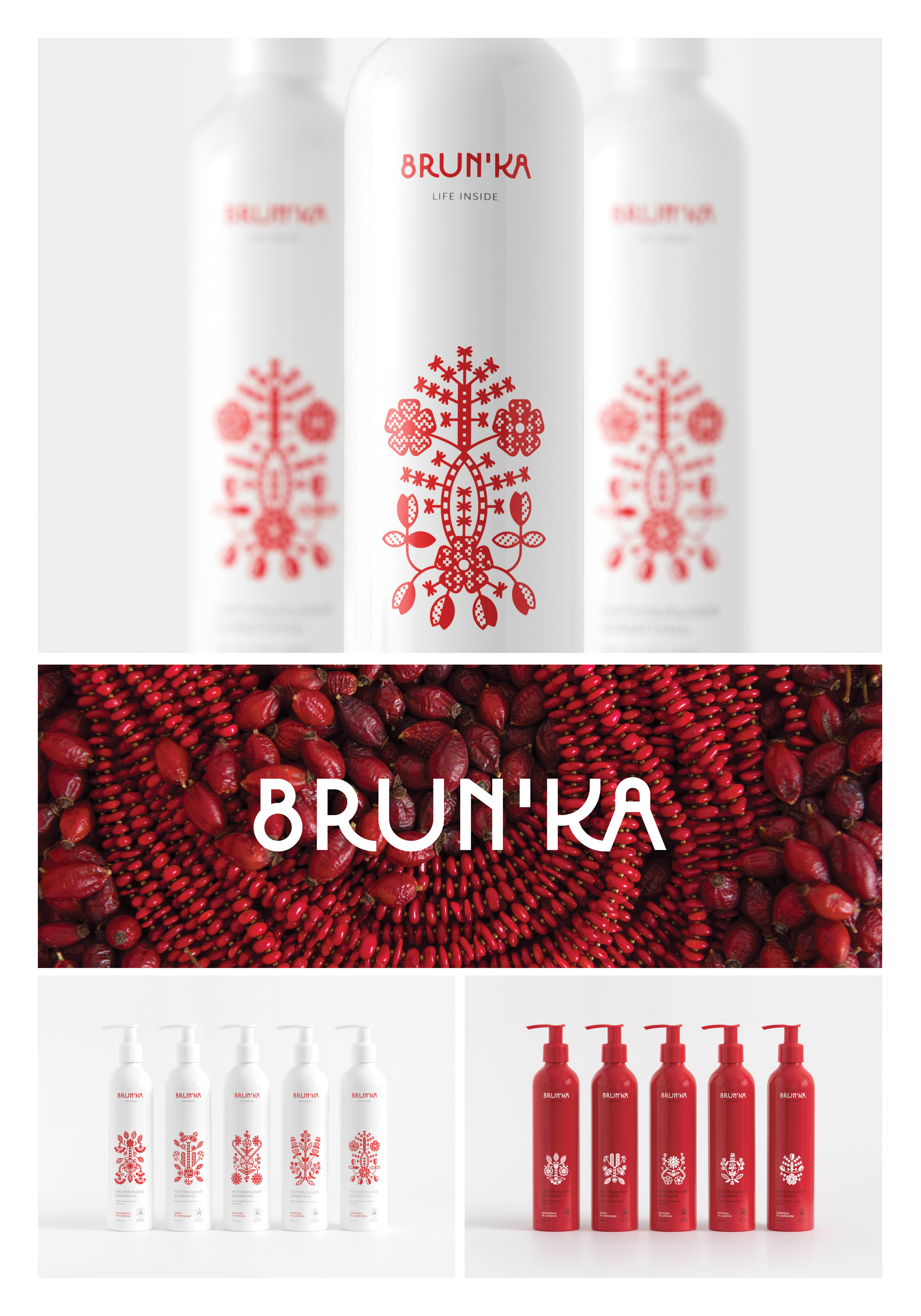
Brun’ka
A-4-2 Graphic design studio by Yurko Gutsulyak
Brun’ka is the first Ukrainian brand that offers certified organic cosmetics based on herbs that are common in Ukraine and were traditionally used in ancient beauty recipes. The brand name Brun’ka means “a bud”. While working on this project, we aimed to combine contemporary design esthetics with original Ukrainian spirit. Rushnyk ornaments traditional for central Ukraine inspired the visual brand language. Rushnyk (the very first mention belongs to early 17th century) is an embroidered towel that has ritual and decorative purpose. The main motif of these embroidered masterpieces is the tree of life, a sacred Slavic symbol which stands for the Universe and harmony. Red floral ornaments symbolize health and beauty. Any images or ornaments were not copied from historical artifacts during design development. All ancient visual materials were used just like an inspiration to create something new and modern. Each ornament on the package shows the herbal composition of a specific product. Related products (like shampoo and balm) with similar compositions have different ornaments, however, the style and basic graphic elements remain the same. That is how the general product line is divided into sublines. The brand embraces both magnificence and simplicity, represented in strictly symmetrical graphic bouquets. Actually, all ornaments have lovely “mistakes” as they were taken right from authentic handcrafted rushnyks or created by nature out of real herbs. It is a way to tell about natural origin of cosmetics and support the brand motto “Life inside”.