Переможці 2019
Best of
A-1 Corporate & Brand Identity
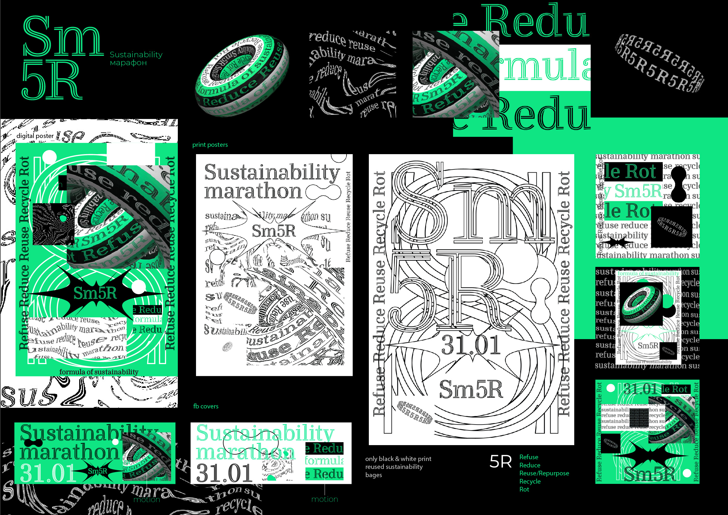
Sustanabilty marathon
A task was to create identity for an event dedicated to sustainable development. And it should be based on the ideas of 5R (Refuse, Reduce, Reuse, Recycle, Rot) and United Nations SDG’s. Fred Pearce, a famous environmentalist, said: “Paper and ink are only a small part of the environmental footprint of printing. The really big part is the plastic and the metals that come with that cartridge that makes up that delivers the ink”. We tried to comply with the principles of sustainable development that is why we used an environmentally sustainable typeface Ryman Eco (it uses an average of 33% less ink than standard fonts). We used eco-typeface, digital projection instead of decorations and made DIY-posters and reused badges. The identity was based on three key principles: cycling, repeating, flowing. They illustrated the ideology of sustainable consumption and production. So we created the identity and visual style based on 5R and SDG`s, emphasized the importance of the event and surprised the SDG`s advocates with our ideas.


