Вхід
Переможці 2020
The Very Best of
A-1 Corporate & Brand Identity
Поділитися:


Fathers Wine. Back to the roots.
A-1-93 R Agency
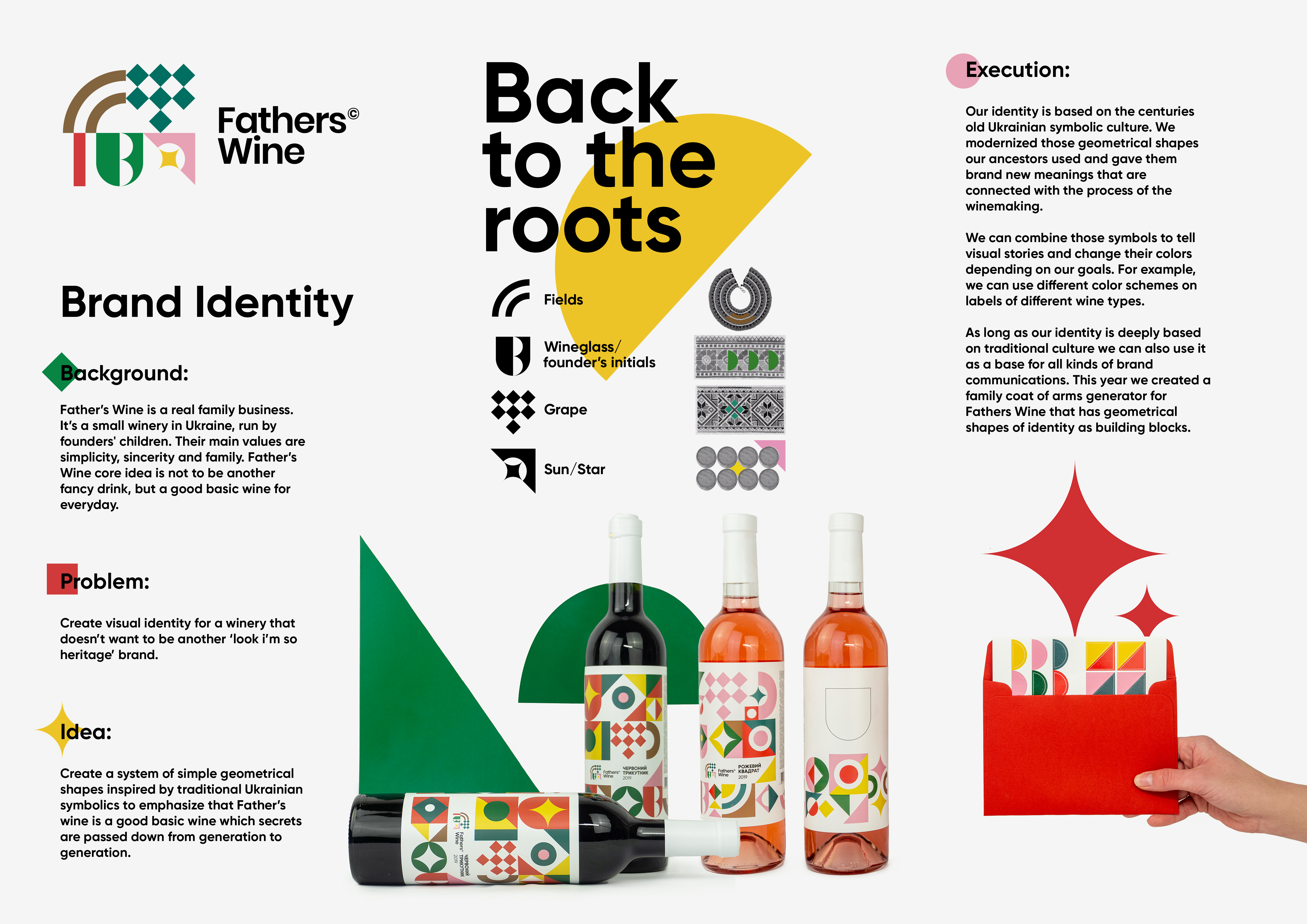
Background: Fathers Wine is a real family business. It’s a small winery in Ukraine, run by founders' children. Their main values are simplicity, sincerity and family. Father’s Wine core idea is not to be another fancy drink, but a good basic wine for everyday. Problem: Create visual identity for a winery that doesn’t want to be another ‘look i’m so heritage’ brand. Idea: Create a system of simple geometrical shapes inspired by traditional Ukrainian symbolics to emphasize that Fathers Wine is a good basic wine which secrets are passed down from generation to generation. Execution: Our identity is based on the centuries old Ukrainian symbolic culture. We modernized those geometrical shapes our ancestors used and gave them brand new meanings that are connected with the process of winemaking. We can combine those symbols to tell visual stories and change their colors depending on our goals. For example, we can use different color schemes on labels of different wine types. As long as our identity is deeply based on traditional culture we can also use it as a base for all kinds of brand communications. This year we created a family coat of arms generator for Fathers Wine that has geometrical shapes of identity as building blocks. Results: The brand became really recognizable among the competitors on the store shelves.