Переможці 2020
Best of
A-11 Packaging Design
Kaizer & Company
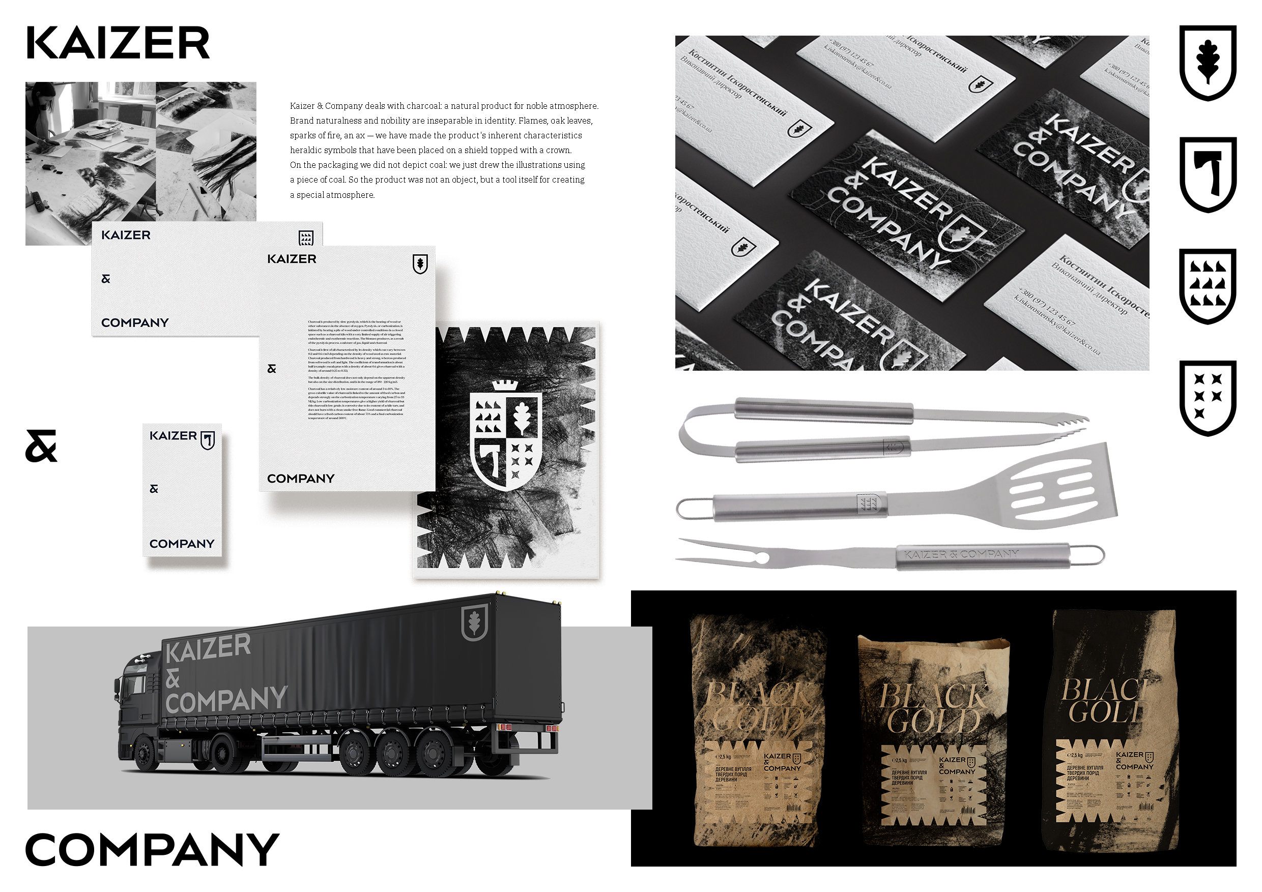
Kaizer & Company is a brand with Austrian roots specializing in charcoal production. To expose the product's features and brand origins, we built our identity based on principles of nobility and naturalness. Flames, oak leaves, sparks of fire, an ax — we have embodied the product's inherent characteristics in heraldic symbols that have been placed on a shield topped with a crown. The modern heraldry logo is based on a typographic grid and can be used in laconic simplified versions. The design of packaging as well as all the brand materials is based on the same grid. On the packaging, we combined the nobility of the graphics with the naturalness of the tool used in fine arts: the background illustrations were made with a piece of coal. This method involves printing in one color: this made the packaging environmentally friendly and adhered to the principle of naturalness to the end.


