Вхід
Переможці 2020
Best of
A-16 Typography
Поділитися:


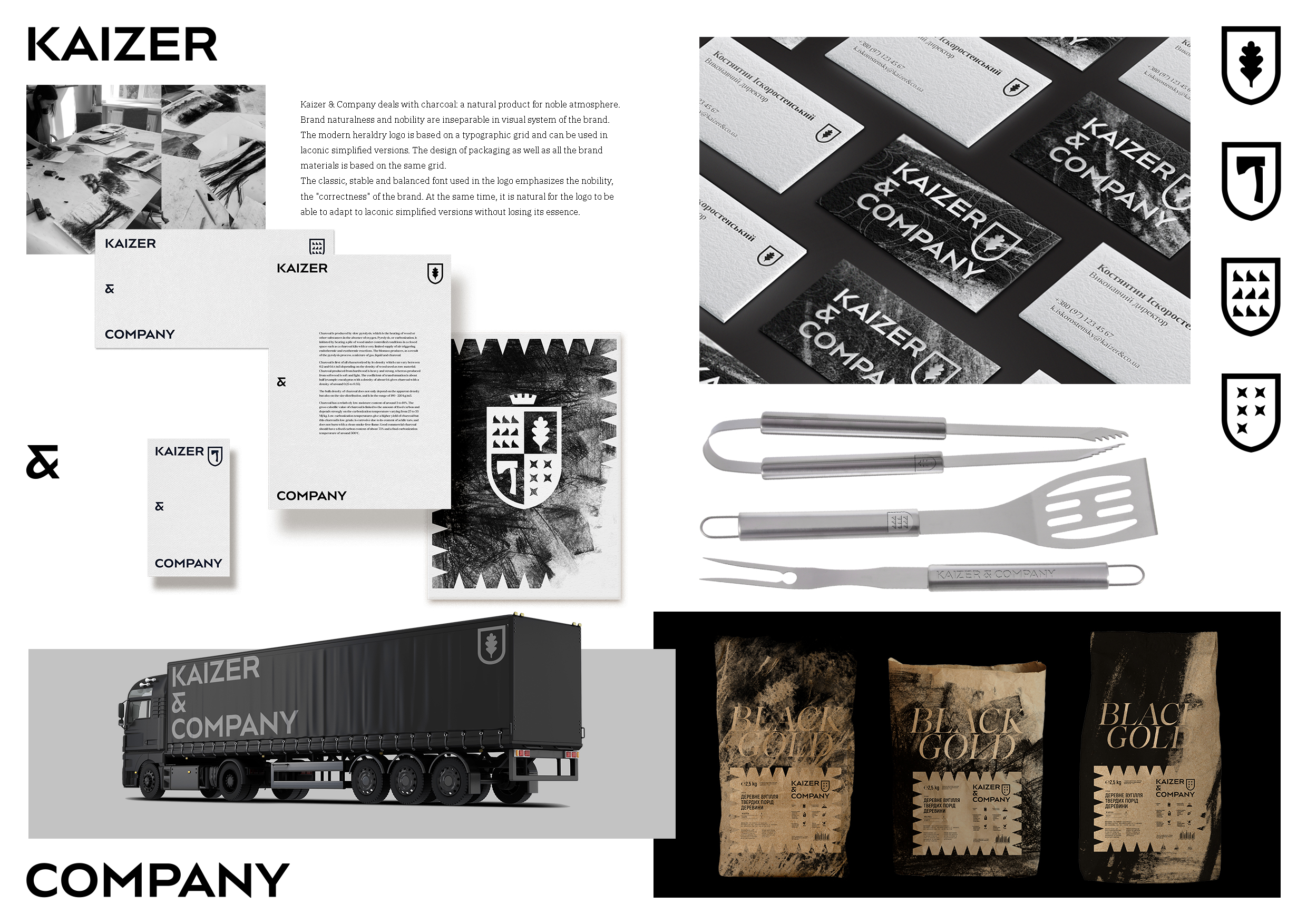
Kaizer & Company
A-16-5 Doris Advertising
Kaizer & Company is a brand with Austrian roots specializing in charcoal production. To expose the product's features and brand origins, we built our identity based on principles of nobility and naturalness. We created a modern heraldry-styled logo by placing on the shield the natural symbols that characterize the product. The logo is based on a typographic grid. The design of packaging as well as all the brand materials is based on the same grid. The classic, stable and balanced font used in the logo emphasizes the nobility, the "correctness" of the brand. At the same time, it is natural for the logo to be able to adapt to laconic simplified versions without losing its essence.