Вхід
Переможці 2019
Best of
A-1 Corporate & Brand Identity
Поділитися:


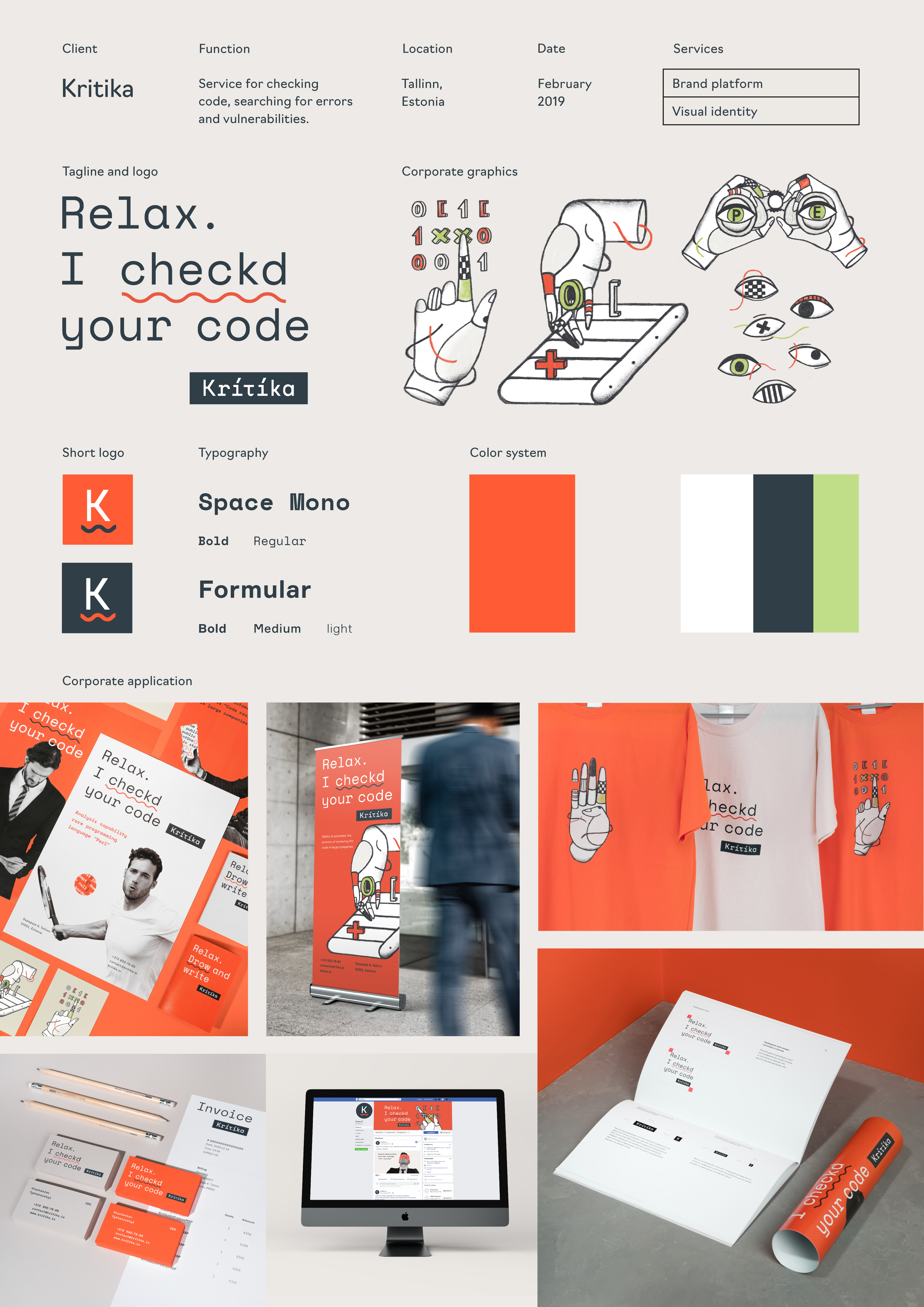
Kritika
A-1-72 League Design Agency
Task. Our task was to develop visual identity for Kritika which is a software product that helps users find mistakes and vulnerabilities in the code written by a software development team. Research. During the client briefing we outlined the mission of Kritika, its competitive advantages, and core customers. The service was developed for CTOs in large companies who want to control the quality of their product but cannot check every single employee. Kritika does this job for them in a reliable and automatic way. Users who apply Kritika in their work can rest assured that everything is under control. They feel that they are not alone and there is something at hand that insures them against mistakes. Having analyzed the graphics of their competitors, we realized that the majority of similar apps look very much alike. They all appear in a way too “digital”, cold, and they don’t seem to have a “soul”. That’s why we decided to emphasize the emotion of using the product with the help of craft stylistics. Concept. As we were looking for a visual image, we decided to create a virtual character and animate the product in this way. Kritika is metaphorically represented as a competent “personal assistant”. She knows the topic very well, has her own opinion, and shows creativity. She is learning all the time by studying new languages and has the same goal as the user, i.e. to improve the quality of the product. That’s why her criticism is constructive and friendly. Kritika spots minute imperfections and gives useful advice. Solution. The logo is based on the mono-spaced font which taps two different sources. On the one hand, this sort of font is used in code editors, which is the direct field of product application. On the other hand, this is the font of typewriters, and the latter has always been a stereotypic attribute of critics and personal assistants. All this together expresses the metaphoric character in a wonderful way. The visual image of Kritika is also expressed with the help of craft illustrations. They show the way Kritika works and emphasize its functional features. To check and correct the code, the service only needs a pair of eyes and hands, so they appear on the illustrations. As for the colors of corporate identity, we also chose those that are closer to the real world and are not typical of a digital product, such as natural carrot-like orange and olive colors, deep graphite, and Swiss white, which is the color of paper. Details. The visual concept is revealed in the details of corporate identity. For example, we made some mistakes in the headlines and underlined them with a squiggly line. This is exactly how mistakes are marked in code editors. Placed under the slogan, the logo resembles a popup message. All the microcopy addresses the user from the first person singular in order to create a feeling of a dialogue. Conclusion. The metaphor of a “personal assistant” helped us to add some character to the service. The latter is also supported by the illustrations and the microcopy. All this creates scalable corporate identity that stands out among the competitors and can be easily remembered.