Вхід
Переможці 2019
Best of
A-1 Corporate & Brand Identity
Поділитися:


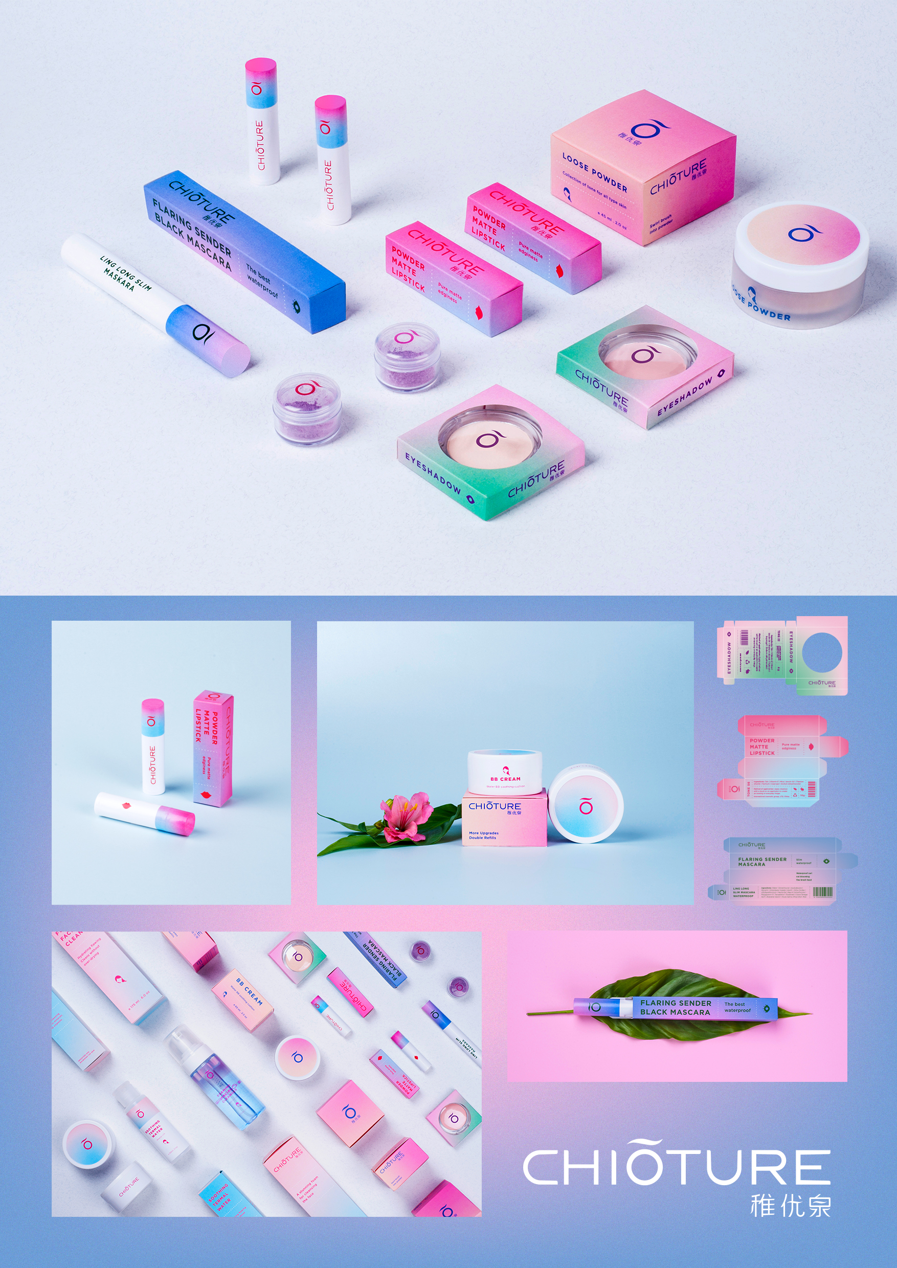
Chioture
A-1-74 League Design Agency
Chioture is Сhinese brand of decorative cosmetics. It is distributed mostly in the local market and worldwide through Aliexpress and Taobao Mall. Our task was to define the identity system and single standard of packaging, due to which brand image could be unified. Also we had to make a brand representation appropriate to its target audience. The main target audience of brand are young carefree girls that enjoy every day of their life and the beauty of the world. They are full of vitality and energy so everything that is nice and bright resonate within their hearts. They just begin to use cosmetics for highliting their natural beauty and for giving an essential care to young skin. Color system of the brand consists of sunrise, blossoming and pastel-sweet shades. It provides a full plunge into the atmosphere of carefree youth. For new CHIOTURE’s image we`ve chosen neutral sans serif font that balances the bright energy of graphics. Thinking about unifying metaphor for two versions of the logo, we made a semantic translation of the three hieroglyphs from which it consists. As a result, we selected and emphasized the letter “O”, which has a meaning “beautiful”, “excellent”, “the best” and is written as the word “Yōu” in English transcription. Icons are brand design elements that facilitate the perception of the product and increase its recognizability. We created a set of pictograms that can be used for additional encoding of product lines and for marking the colour of make-up product.