Вхід
Переможці 2021
Best of
A-2 Campaign Branding & Identity
Поділитися:


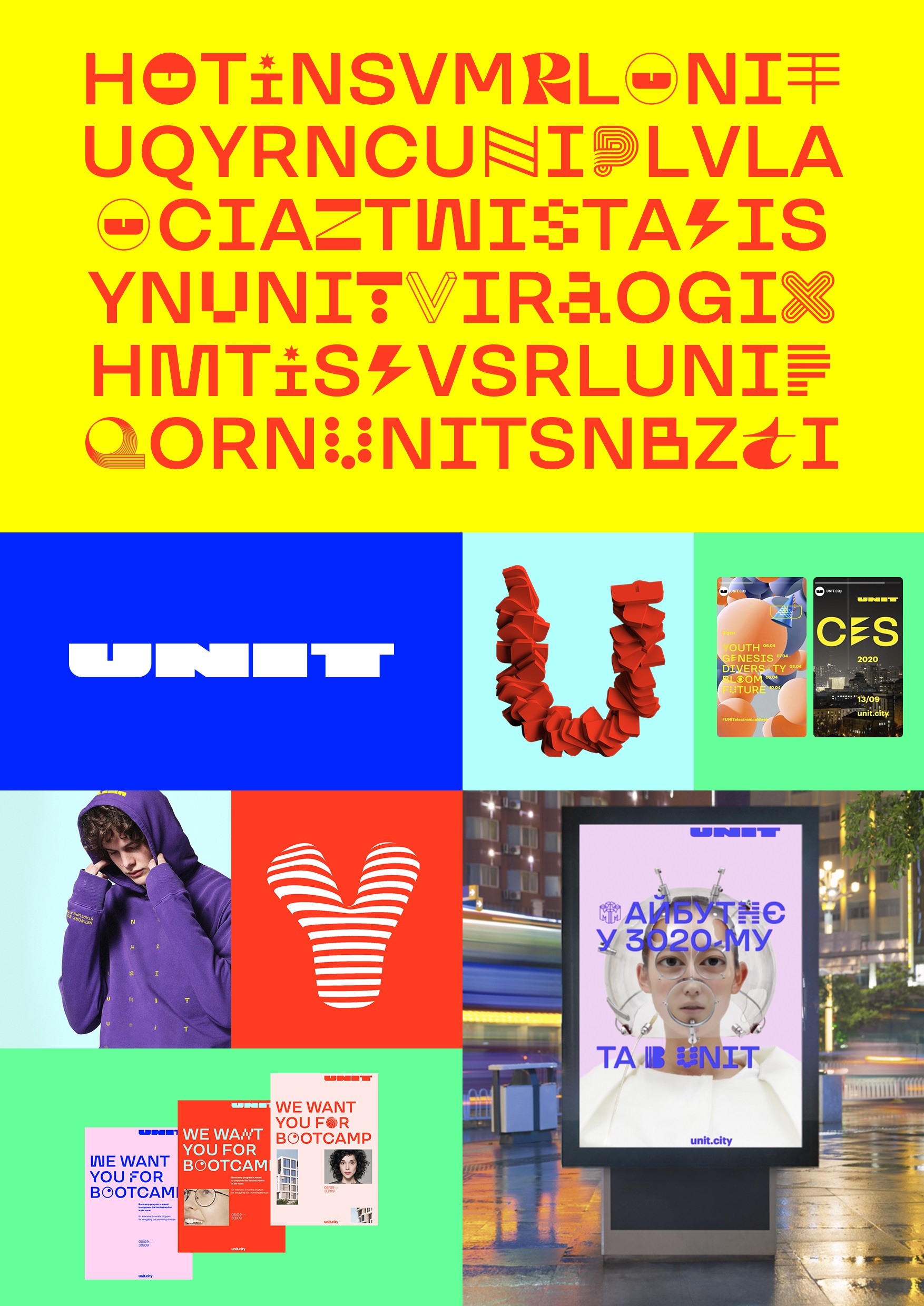
Design system for innovative park UNIT.City
A-2-10 TWID Creative Studio
For innovative park UNIT.City was developed a design system. It allows to work with multiple ecosystem projects, conforms to new brand’s positioning and professional development goals. Identity shows technological spirit of brand. Logo, font, wide palette of colors and images make visual language of UNIT.City bright and free. There also was created a grid, which became the basis for the ratio of style elements and makes working with different materials easier and unified. During the creation of logo emphasis was made on the letter U. It became a full-fledged alternative of logo. The names of all ecosystem projects are now displayed after the dot in the same row as ".City". In addition, a pattern localizing UNIT was created in accordance to circuits of respective territories. New unique font is based on the grotesque TT Travels and a whole set of graphic symbols (about 5 per letter). This one of distinctive elements of identity allows to focus on the message. Graphic letters can create independent plots and work in animation.